Shipping the new GitHub Issues
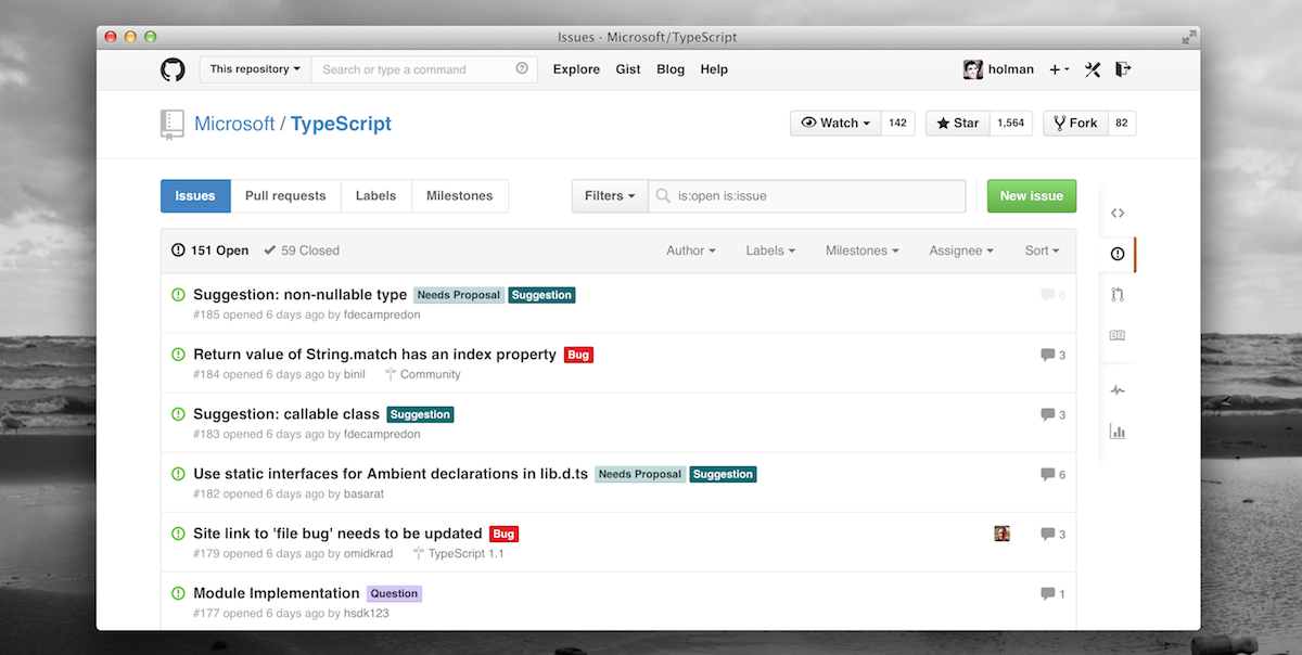
We started work on the new GitHub Issues over nine months ago. It was a bit of a crazy ride, but I’m honestly stoked about what we shipped. For the quick low down on what shipped, read the GitHub blog post.
Given the length and scope of the project, I wanted to share more than that blog post and tell the story of how we went from a single pull request to the shipped feature you see today.
Buckle up.
Table of contents
Instead of splitting the article, I figured I’d write until I couldn’t and just give y’all a helpful table of contents.
- Why
- Logistics
- Opening a pull request
- Determining features
- Iterating
- Validating our ideas
- Shipping it
Why
Perhaps the most important question is why would we even work on Issues? And what exactly would we do with it? How did we know that it needed the love?
Use it to improve it
We spend most of our time on issues at GitHub. Internally, we use the hell out of Issues for everything. Have a problem with the office? Open an issue. They’re a written record, cheap and fast to create, and searchable. Between our extensive usage internally and the number of folks here contributing to open source projects, we’re some of the most prolific issues users.
Bottom line? There was no one thing that motivated us to do it. We just started to notice some things that could be better, like:
- It was starting to feel dated compared to other aspects of the site and enough folks spoke up about it.
- The interface was a bit cluttered with nav and filters on the top, right, and left sides.
- Searching for issues was an entirely different experience. We didn’t have a dedicated search for issues, so when you searched for a specific one, you left your repo’s issues list and landed on a search results page. From there you couldn’t triage any aspect of the issue until clicking into it.
- We were missing a bunch of information on the issues and pull request lists—task list progress, milestone name, build status, etc.
- At least two of us wanted to work on it, and we both were excited by the possible outcomes the more we talked about it.
Once we had that kind of feedback shared (you know, if you see something say something), and folks agreed that those were worthy problems to solve, we got to work writing code.
For what it’s worth, this is just about how all product or redesign work goes on the GitHub.com side. Find a problem, propose a solution (usually with code), get feedback, and find a way to ship it. We’re looking into how we can improve this and apply a process or checklist to all great ships, but that’ll take some time.
Metrics
We didn’t spend much time looking at analytics or metrics for Issues before diving in, but we have historical data we can compare against. Throughout the project we tried to optimize our database reads and ensure we didn’t have extra HTML and CSS lying around, but that’s about as far as we got for the front-end performance stuff.
Logistics
Before I get to the good parts, first let me explain a few things about how all this went down logistically as it’s important to have a bit of context for this given our usual shipping speed.
Nine months!?
So, first, why nine months?
- We had two large related projects going on at the same time: the issues redesign (internally and hereby called Issues 3) and our conversations redesign.
- The conversations redesign took our attention away from Issues 3 after a few weeks. Ultimately it derailed us for around three months while we iterated, shipped, and cleaned up after ourselves.
- We had a bit of trouble keeping the two projects separate. We ended up blending some ideas and that also set us back.
- We improved a ton of our infrastructure around search and issues performance.
- We spent a lot of time trying things out for a week or so between bigger iterations. Our goal was workflow improvements, so we need to work with these ideas more so than other ships.
It was a challenge for all of us—me in particular—at balancing two separate-but-related efforts. Crossing the streams ships meant adding complexity, spinning our wheels, and losing sight of the specific end goal for each ship. I think we did an alright job of realizing that quickly enough and ended up getting a ton of work done.
Who
The Issues 3 core team was essentially three people: two developers and one designer/frontender (me). The extended team included our Ops and database folks, search engineers, and people from support and docs teams. Plus, dozens of others in the company who provided feedback via issues and pull requests throughout.
Working together
We found out really early on that all of us on the core team worked pretty damn well together. We moved fast, broke things, opened tons of pull requests and issues, called each other out on bullshit, propped each other for amazing ideas. Most of it happened fluidly and off the cuff. There was hardly anything formal about it until we were near ship time.
Here are two examples of how most of our work was done.
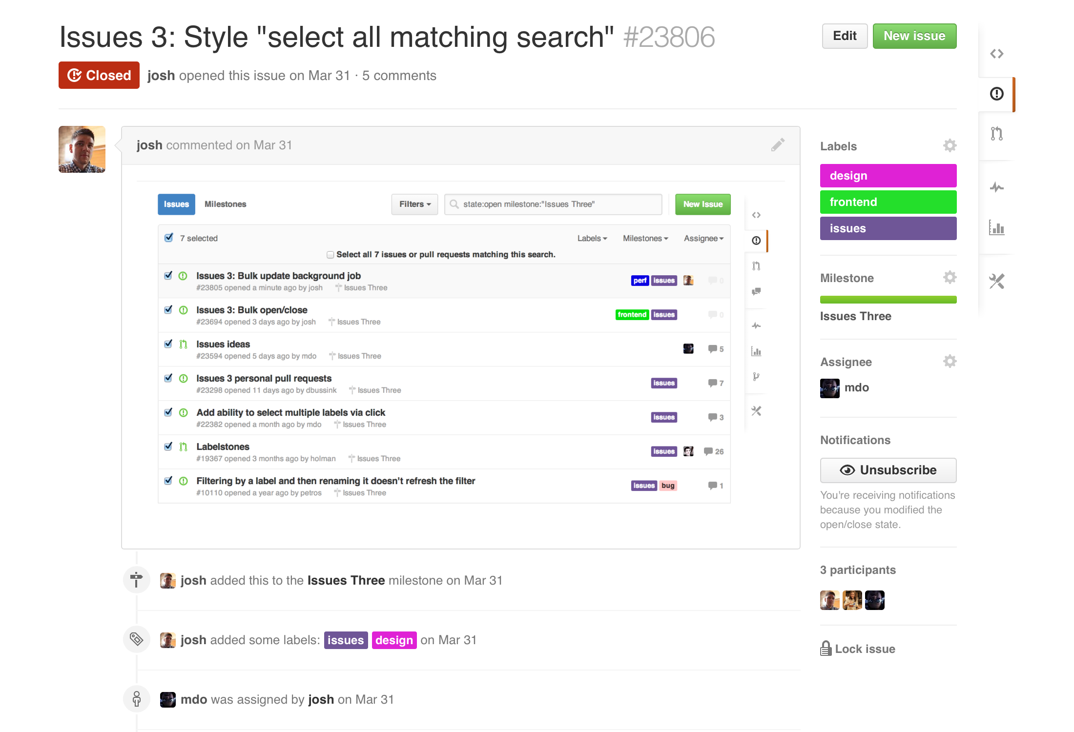
Issues were opened with specific feedback by one of us (or others across the company), labels added, milestone set, and someone assigned. When we had fixes to deploy, we opened pull requests.
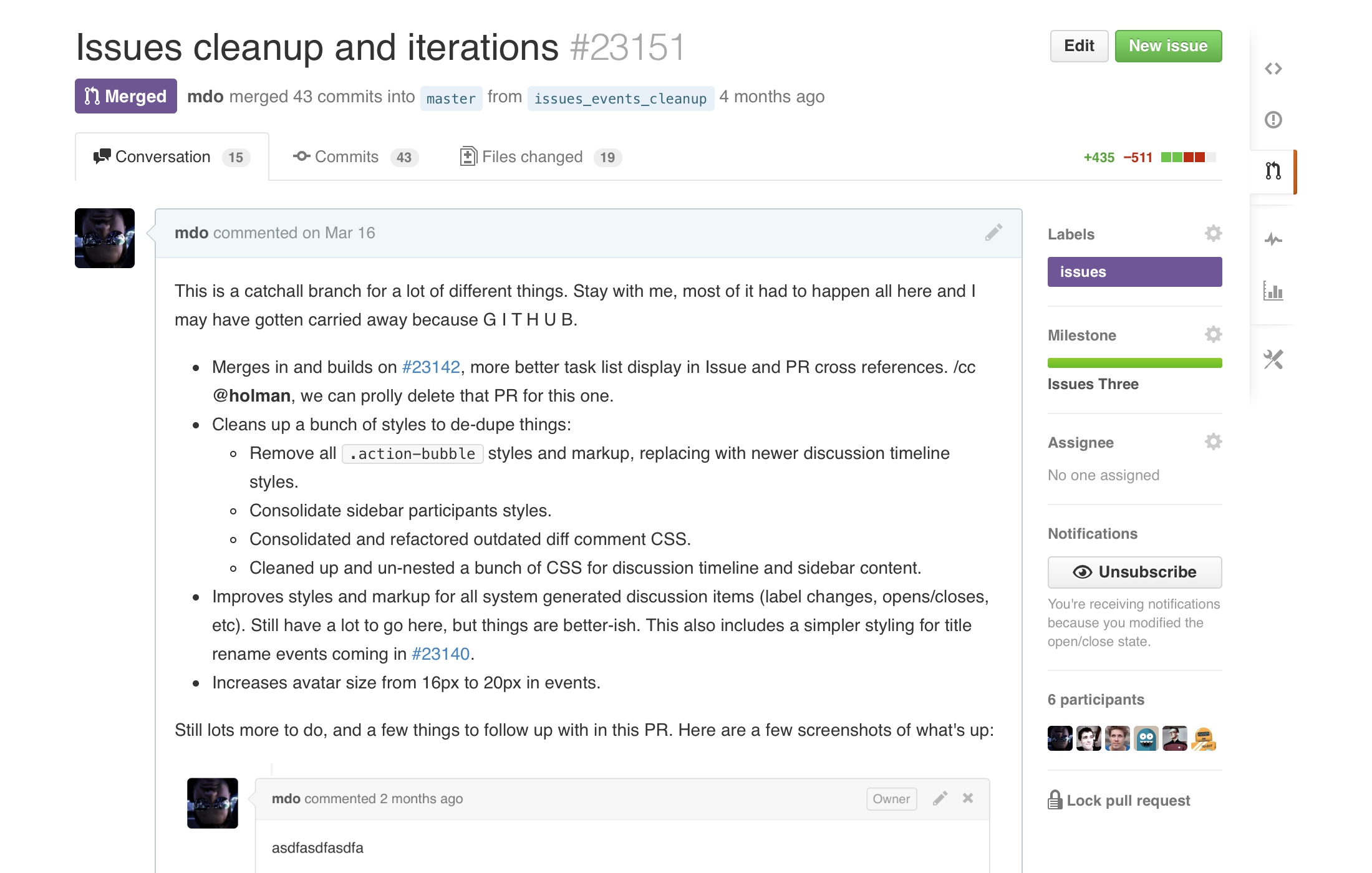
We’d try to be as detailed as possible. We included screenshots, /cc-ed the right folks (e.g., the @github/issues team), and then quickly shipped it. Given the early work on Issues 3 was only team shipped, we could afford to screw things up every now and then because only we would be affected.
There was still a chance of screwing up other things mind you, and I may have done just that a couple times, but we were pretty well shielded.
In issues and pull requests, we’d use task lists whenever possible. Similar to full fledges issues, we’d try our best to be super clear and assignee folks or ask for help when we needed it.
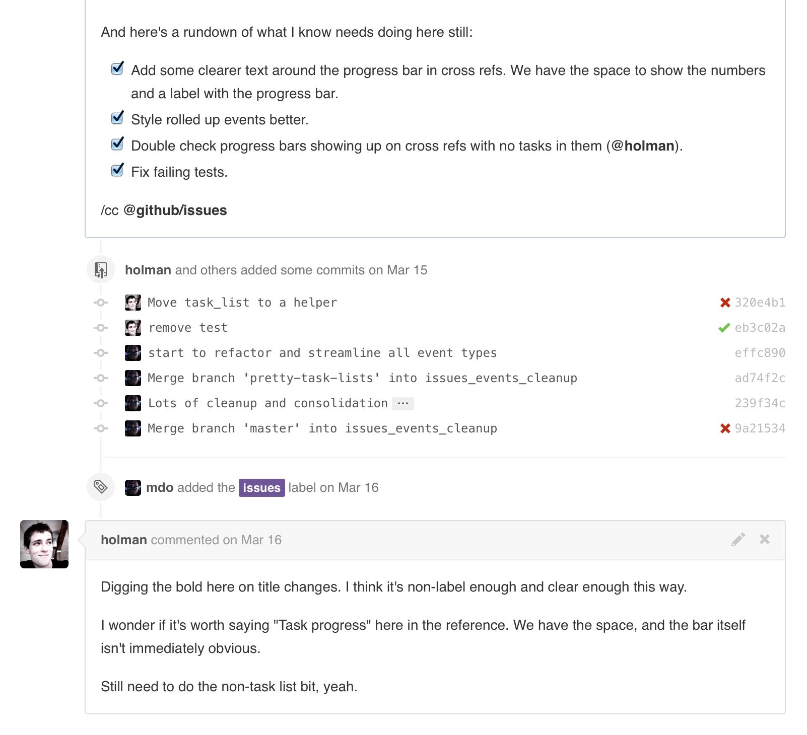
Those issues task lists were especially useful when we got closer to shipping and could use them to do production readiness reviews, check in with the docs team on how their updated screenshots were going, and review last minute tweaks or bug fixes.
Put another way, we used GitHub Issues to build GitHub’s new Issues, and it was pretty damn awesome.
Opening a pull request
Okay, now, back to the product work.
A bunch of us had been talking about updating Issues for a long time, but it didn’t take off until Holman opened the first pull request. (That’s often the case—some ideas just stall out without some code to kick them off.)
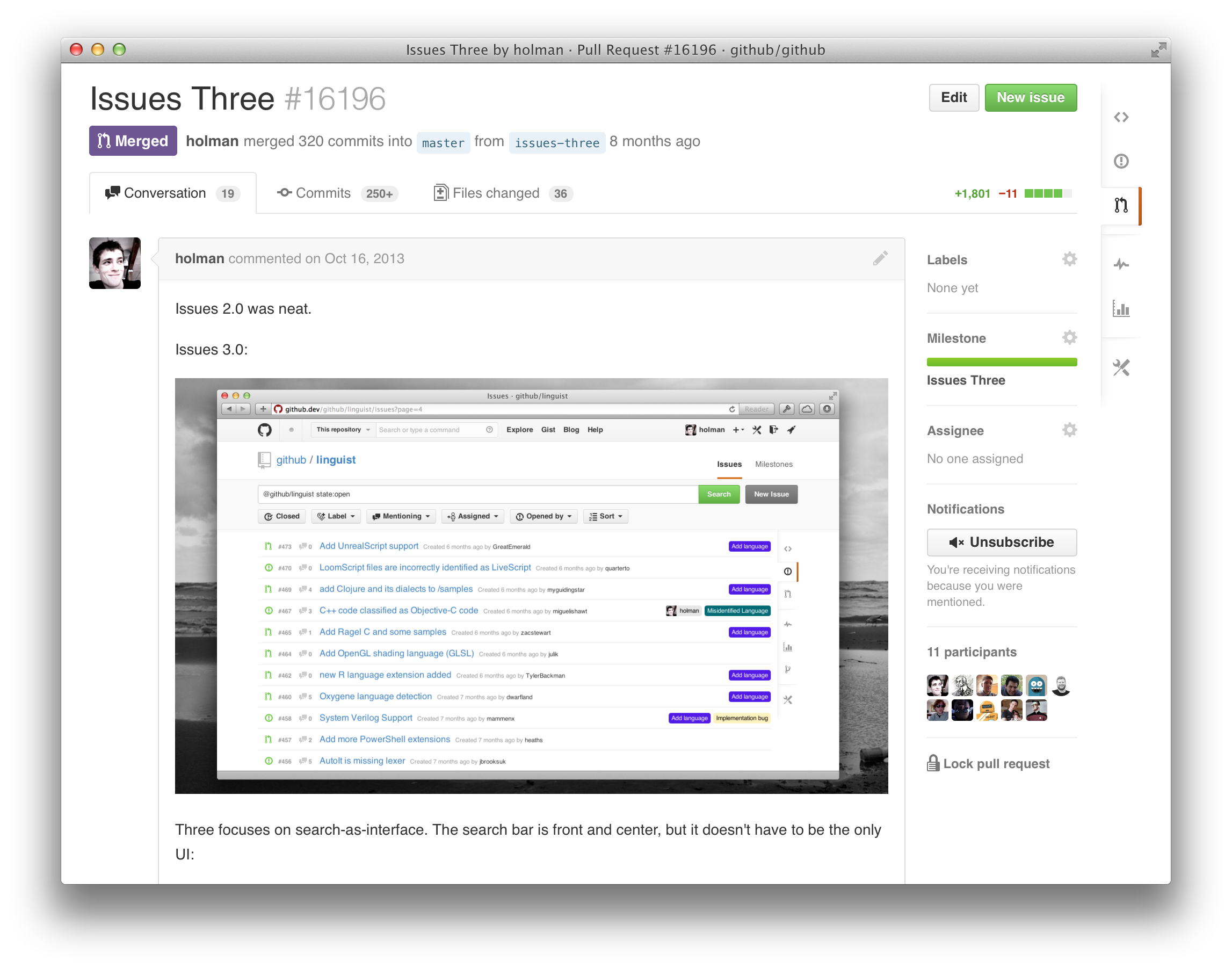
The first Issues 3 pull request was opened back in October of last year, and while the aesthetics and layout details changed a lot over time, the core idea never did. This would make search the interface.
The idea itself didn’t feel all that radical, but it did heavily influence the architectures and interface. Under the hood, we leaned into Elastic Search and MySQL to build out the functional tidbits. Today, Elastic Search powers all the custom search queries while MySQL handles the general issue and pull request listing and more.
Interface wise, it’s pretty clear that search was the focus early on. That search bar was huge! Everything you did updated the search bar, and heck some things were (and still are) just easier when you type in the search input. I was honestly hesitant about this, but the team’s excitement kept us moving.
Determining features
That first pull request had it’s own feature set: more search, triage mode (bulk actions), and faster access to issues. Along with that first iteration though came a bunch of spontaneous ideas from within our team as work progressed.
Quite a few of the features we shipped with actually came organically out of that.
- Search is obviously the huge feature focus in Issues 3, but the specifics were worked out as we went. We defined the search syntax, added negation searches (like
no:label), and more state queries (likeis:merged) as we went along. - We found ourselves doing the same simple searches over and over again, so we restored the old quick filters (like Your issues) and added a few more.
- Our audit log—the history of changes to titles, assignees, labels, and milestones—went from offhand comment to part of Issues 3 in just a couple weeks.
- Notifications on assignee changes went the same way. A few of us were talking about notifications one afternoon and we realized this wasn’t a thing yet. So, we coded it up and made if part of Issues 3.
We had a quite a few things in mind from the start, but just as many important features came naturally out of actively using the thing we were building. While that added extended the time we spent on the project, it was absolutely worth it.
Separately, one thing that’s come up a lot in the last several months has been project management on GitHub. The term project management is rather vague. There’s a multitude of ways in which this could manifest in GitHub, all of them independent of improving our existing issues and search infrastructure and interface. As such, it wasn’t part of this project.
I’m specifically avoiding talking too much about what we didn’t ship as there’s still a good chance we’ll ship those things. I don’t know when, and I don’t know how, but there’s still so much we can do with Issues—a fact I’m sure no one will disagree with.
Iterating
The early months of our work on Issues 3 (after those new conversations shipped) was mostly spent churning out iterations on the interface. While others focused on the underlying code, I fiddled around with the layout, aesthetics, and more. Here are a bunch of those iterations and a few brief notes regarding each.
Earliest iterations
As mentioned earlier, this was the opening screenshot of the issues index page, the work of one engineer just going to town on what a vision for Issues could be. Turns out he was pretty spot on as well.
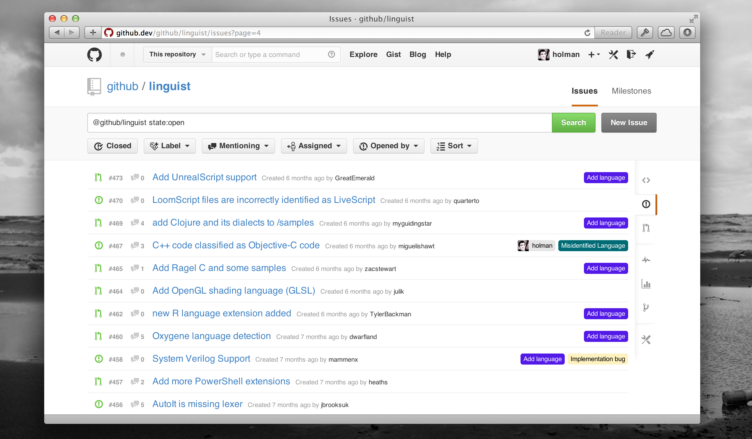
The design is rather inbox-y with the huge search, buttons for filtering and triaging, and the single line issues list. The reason for that was to add and streamline information to keep it in a single row for more content per page. One line per issue was a bit of a crazy goal and we’d struggle to keep to that as we iterated more.
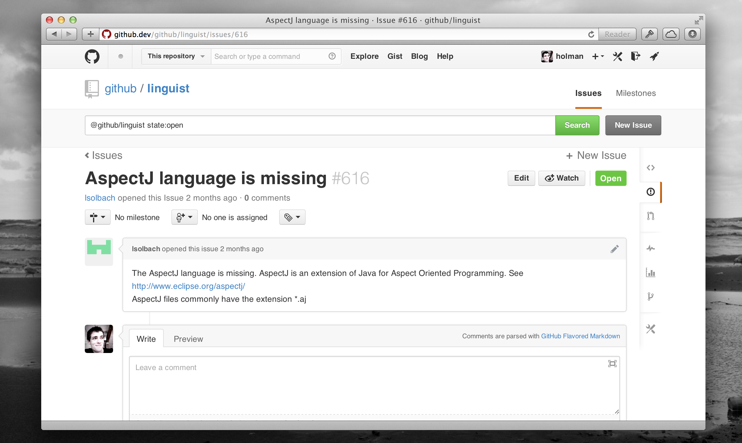
This screenshot is a bit of a mess as you can tell. It was from one of those interstitial states where the conversations redesign and Issues 3 were becoming confusingly intertwined. The omnipresent search at the top was one (bad) idea we tried to carry over from the issues index to individual issues.
We also tried to have no sidebar on issues with this—you can see the milestone, assignee, and labels at the top of the page. Things got messy, but we were fast and flexible enough to quickly try out and discard ideas.
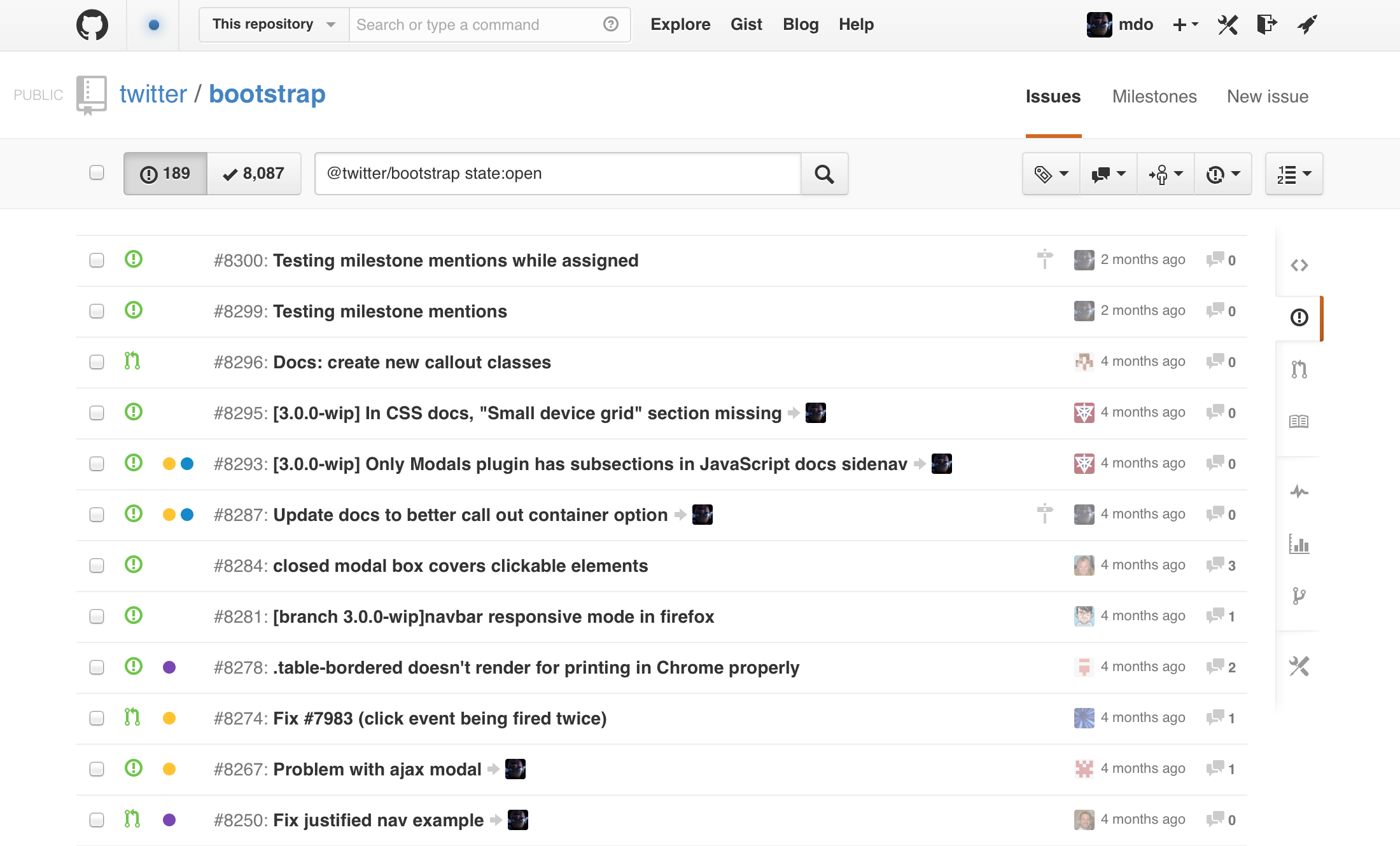
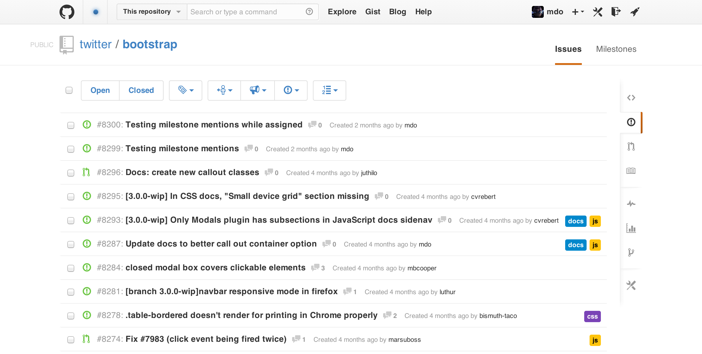
Once that initial design was merged—it was team shipped, which meant only a few GitHubbers had access to it—I started tweaking the design to explore slightly different directions. Briefly, here’s the what and why:
- I minimized the search field because I still didn’t think search would or could be the primary interface for people of all ranges to interact with first.
- I condensed the search and filter buttons into one row so you didn’t lose as much vertical real estate.
- I tweaked the display of content in the issues list by collapsing labels into dots (revealing the label name on hover via tooltip), giving more weight and contrast to issue titles, and adding more content in a slightly more tabular design.
One of my favorite aspects of this was the arrow to avatar for assignees. To me it read super naturally—issue titled such and such assigned to username. Later it’d cause problems for aligning and wrapping longer content.
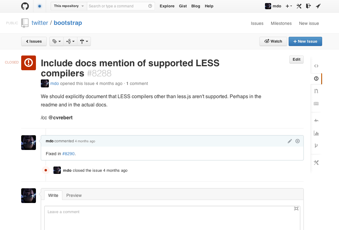
The design of that issues list page also mapped to the individual issue again. Things were getting even more mixed up between Issues 3 and the conversation redesign as I streamlined the gray bar and the assignee, milestone, and labels lists into it. Notifications also got moved up from the bottom of the page to a single button on the top right.
The goal here was to present all your actions above the rest of the page content. This way, hierarchically, it reinforced the idea that you were taking action on this page—this issue.
There are some more failed ideas in here from an earlier iteration of the conversations redesign. The state indicator—the thing tells you it’s an issue or pull request, and if it’s open, closed, or merged—was like a big avatar. The opening comment was (literally) unboxed and enlarged to function as a sort of blog post style introduction to the issue or pull request. This never really ended up working out as it brought with it a few annoying differences across how we layout comments and render their Markdown content.
Aesthetics
For a long while most of my changes felt superficial. I played with button styles, orientation of search and filters, and different representations of content within the issues list.
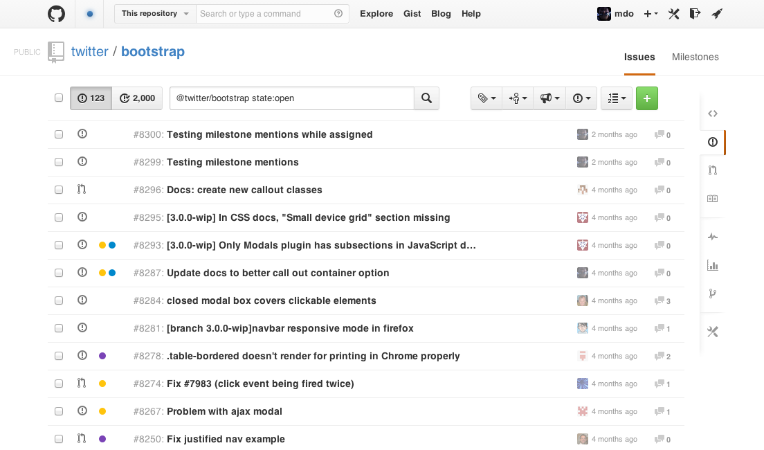
I removed the light gray background to prevent more horizontal stripping of content, something GitHub and tons of other sites seem to struggle with. Other super subtle changes include lightening the comment bubble and count for issues without comments.
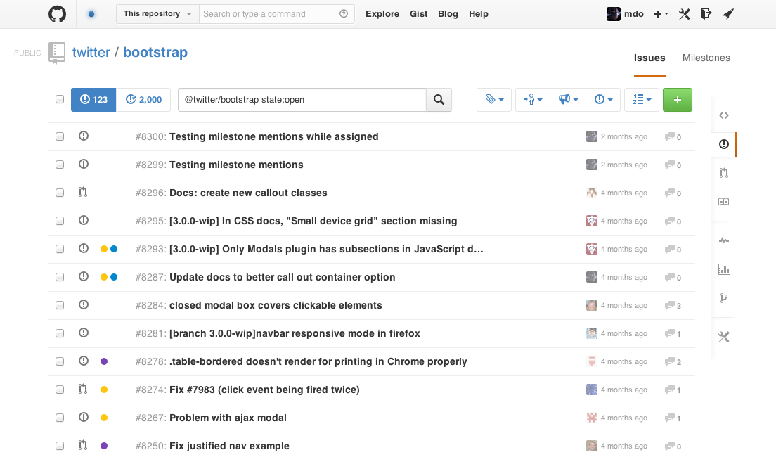
More visual changes as I try out lighter button styles to make the page feel less full of administrative cruft. It wouldn’t work out that well for buttons originally, but those styles later resurfaced in our subnav.
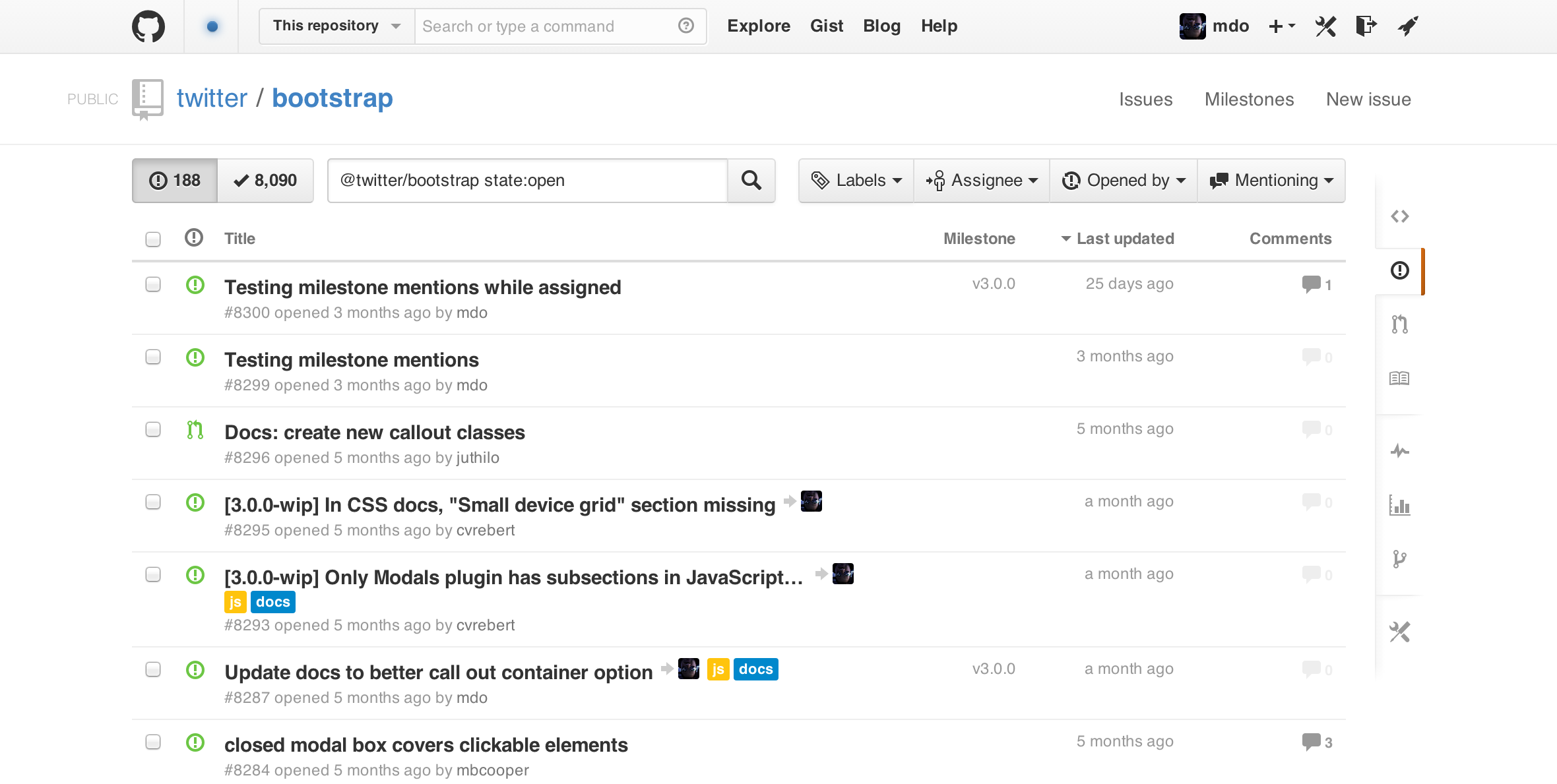
I spent far too much time flipping between icon-only buttons and icon-text buttons. At this point I also started to solidify on some of the more basic aspects of the issues list that I stupidly tried out earlier on. For example, I started expanding the labels again to their natural textual state. I also restored the stateful color—green or red for open or closed—to the issue/pull request icons on the left.
Searching vs. filtering
While I struggled with it repeatedly, there was a moment when I suggested we abandon the new search field entirely.
It was starting to annoy me that I had up to three ways to get to things:
- Clicking the filter buttons
- Searching by hand
- Hacking the address bar and using URLs only
It felt odd that we had so many avenues to get to the same content. Eventually though, I’d come to peace with this and realize it was an advantage. Some folks love using buttons for everything, some work faster typing and using keyboard shortcuts, and some love their address bar more than life itself.
Put another way, the more access points, the more we could appeal to different workflows across teams and organizations.
Structure
Throughout our work on issues and conversations, I frequently got care-mad about the intersection of our repository navigation, page headers, section subnav, and our issues filters. I also got fed up with the single-line issues—it just wasn’t working.
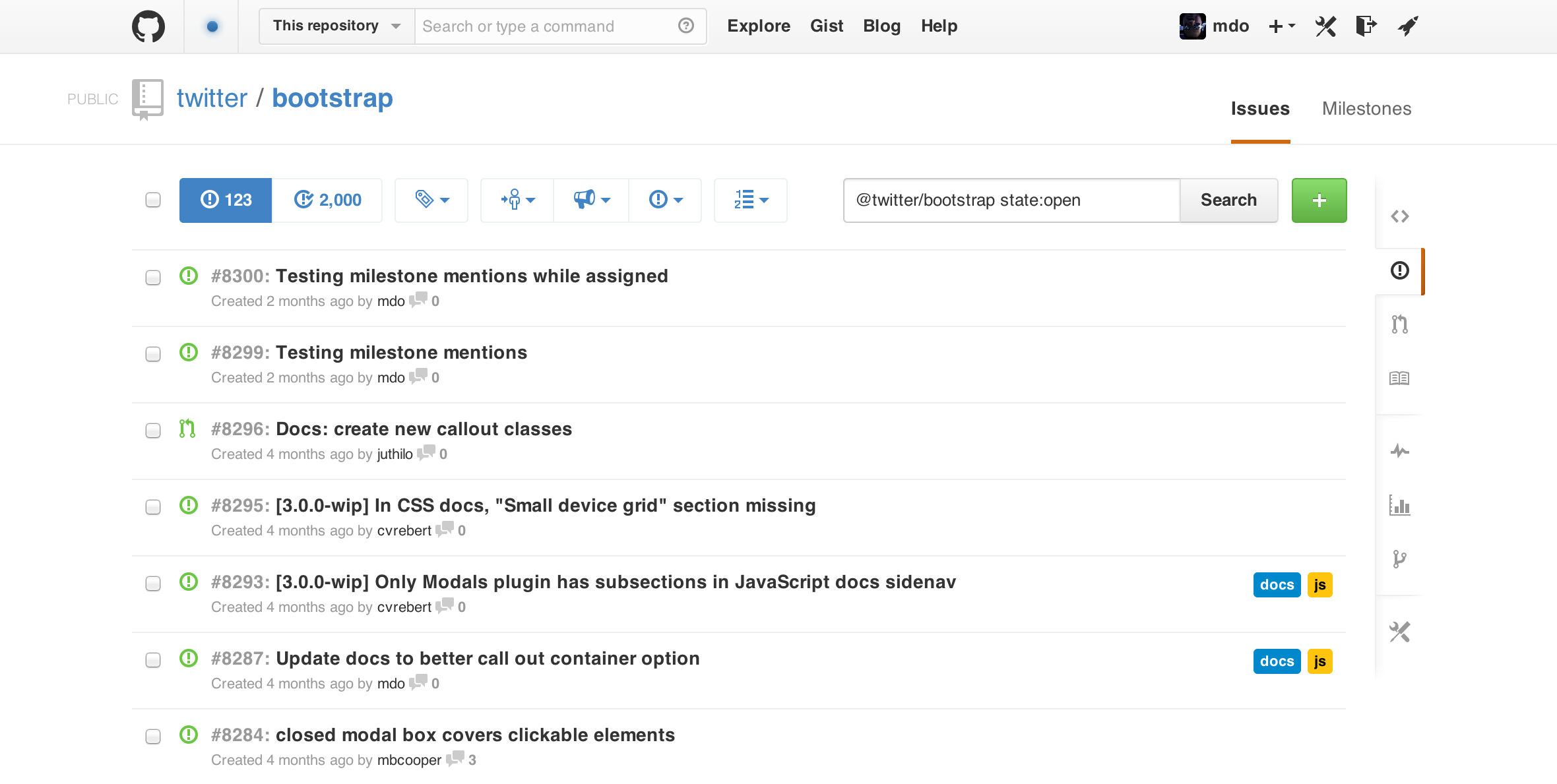
So I started screwing around with more subnav-search-filters layouts and the placement of content within the issues list. The subnav moved around from the top right of the page header to the top left of the issues list and more. I think we flipped around and tried out even more ideas, but mostly these were our two “best” options.
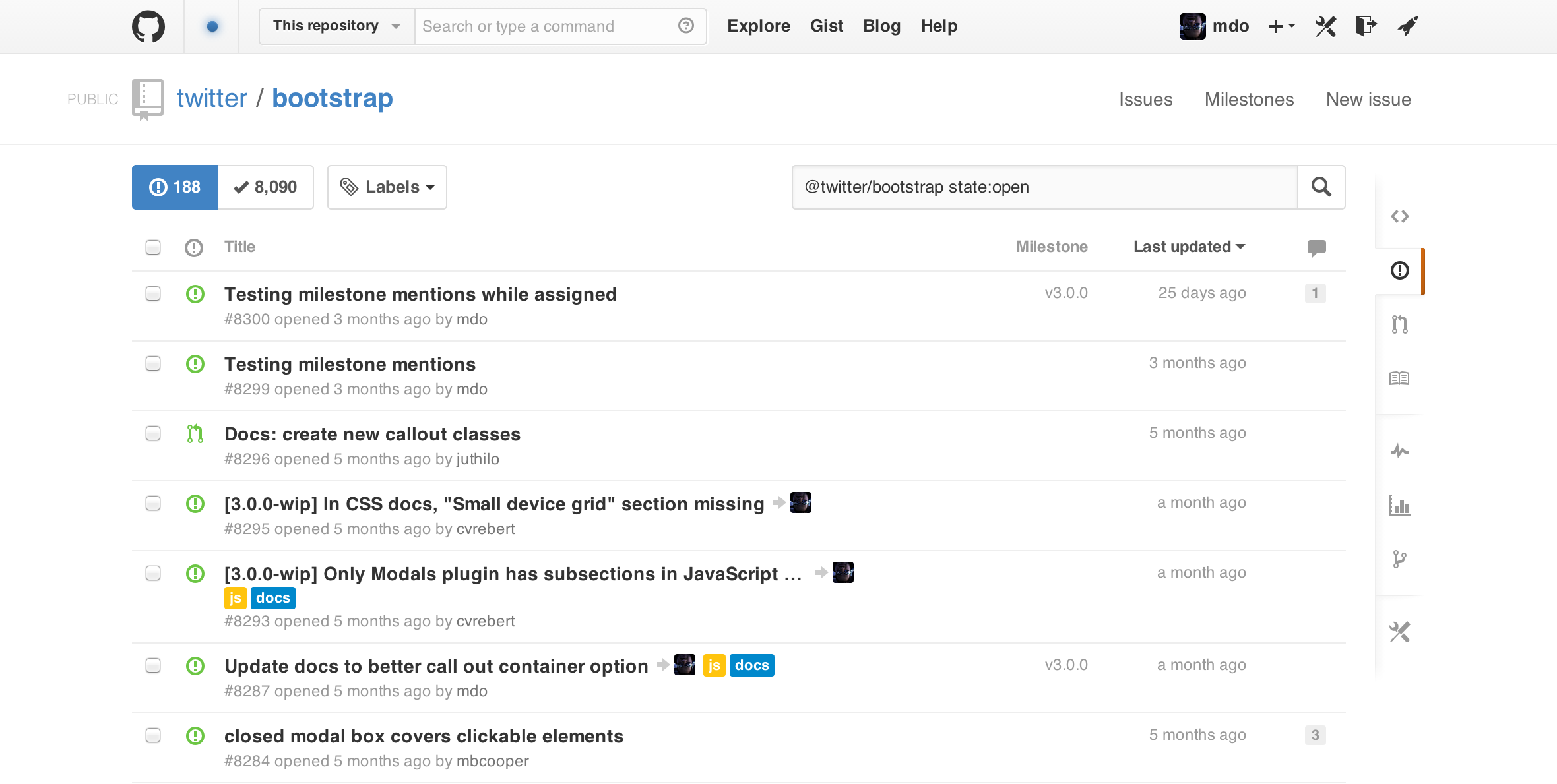
The table-header style approach to our filters here was one of my favorite aspects as well. It felt simple, elegant, and functional and came without all the added weight that a series of buttons brings.
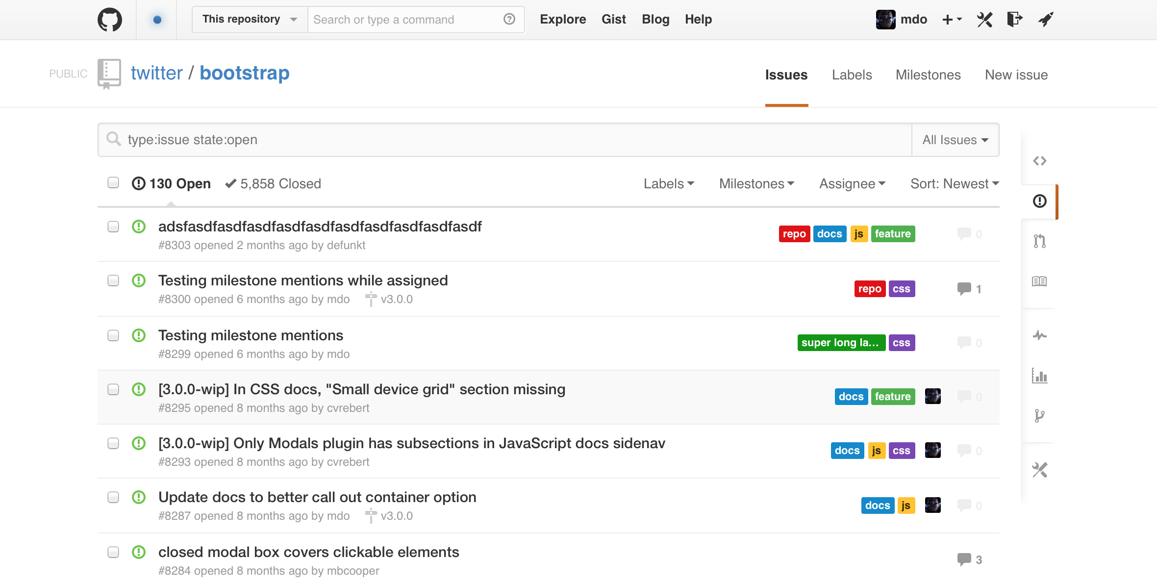
We realized for awhile that because we had moved the subnav—previously tabs in the old issues UI—to the page header, we suddenly had more room again. That meant making the search field ginormous again.
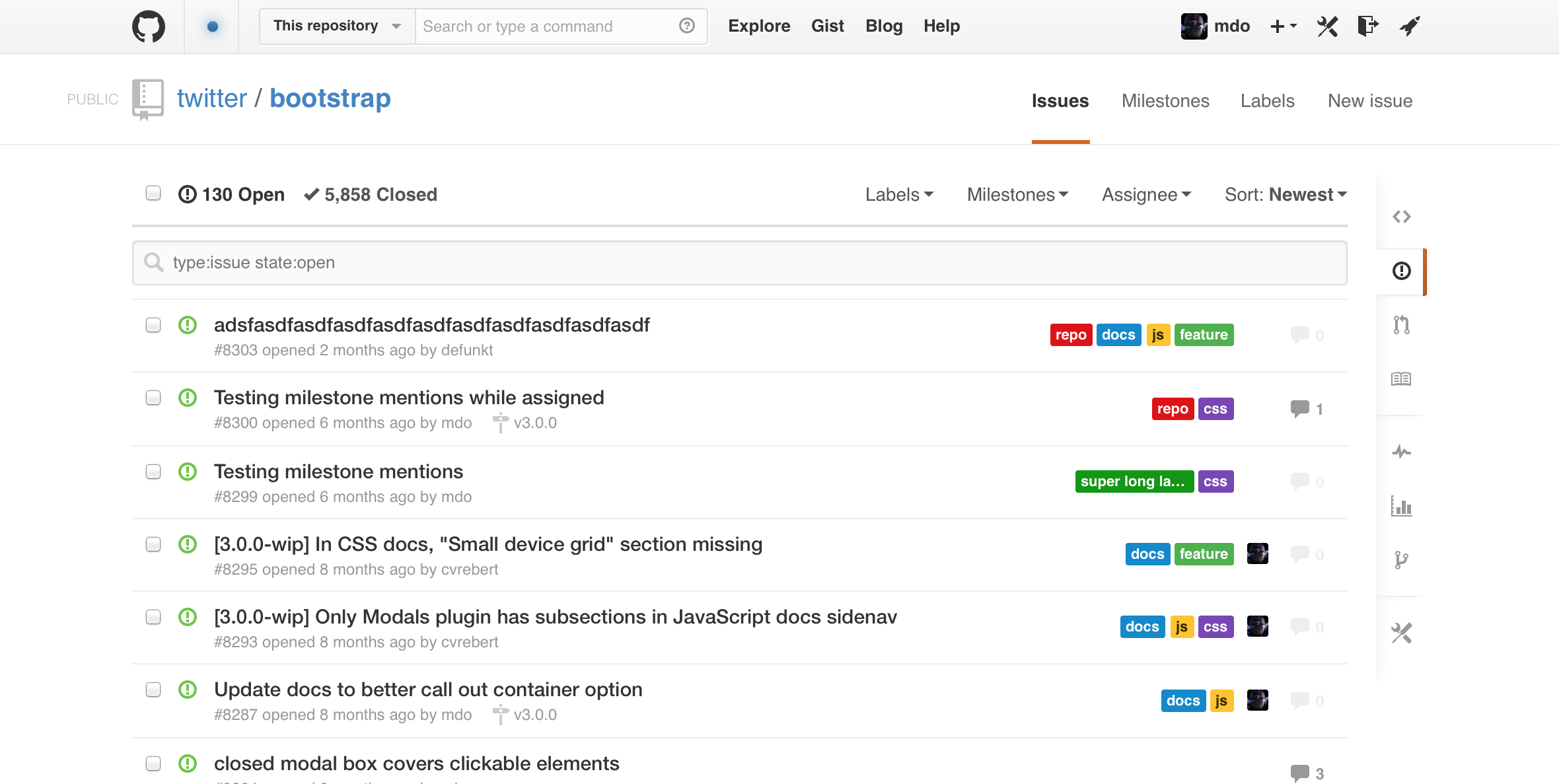
But something still didn’t feel right in that layout. The hierarchy felt lost again and it was rather difficult to find relationships between content and quickly find things.
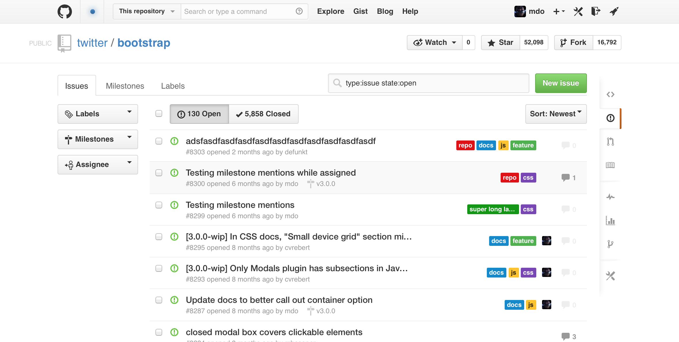
At this point I panicked for nearly an entire day. I gave up everything about the new layout and tried a few ideas to see if a tabbed interface and side column would make more sense again. I don’t know if it’s just because what I tried was absolute shit or if the idea just didn’t make sense, but it felt wrong.
Seeing that it felt wrong again to try the side column and tabs, I starting feeling a lot better about our new direction.
Additional views
While all this work was being poured into the main issues list, we had plenty of other iterations on labels and milestones. Labels in particular are fun to compare before and after:
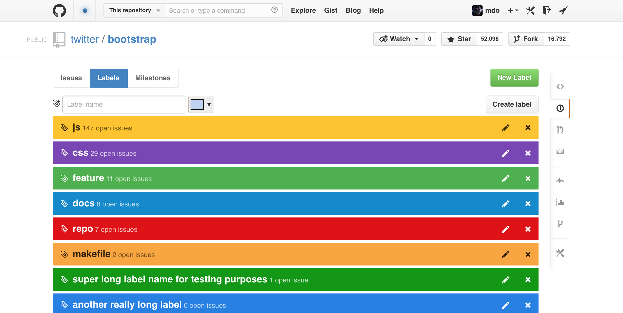
The original pass was kind of fun and quirky, but not the most practical.
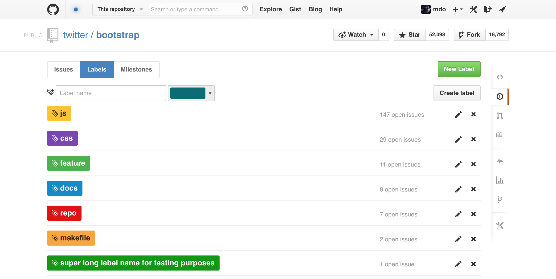
We toned it down and shipped a super basic one-page list of your labels. We wanted to add more sorting and metrics, but time just didn’t allow it. Maybe next time around.
We spent a decent amount of time thinking about how to educate folks about available search queries. Two earlier options include a popover when focusing on search and a set of links at the bottom of the issues list.
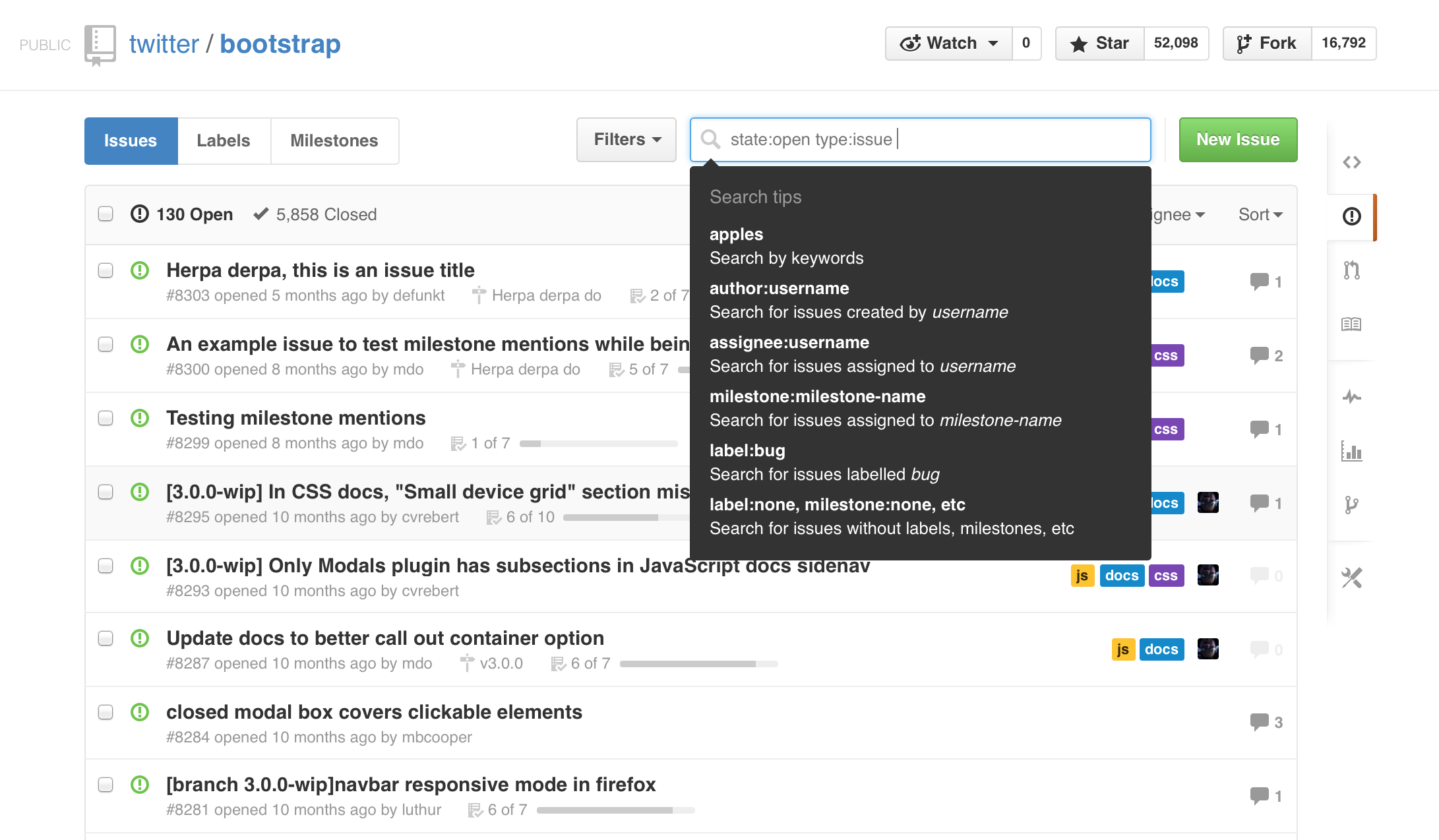
Compared to a set of callouts below the content:
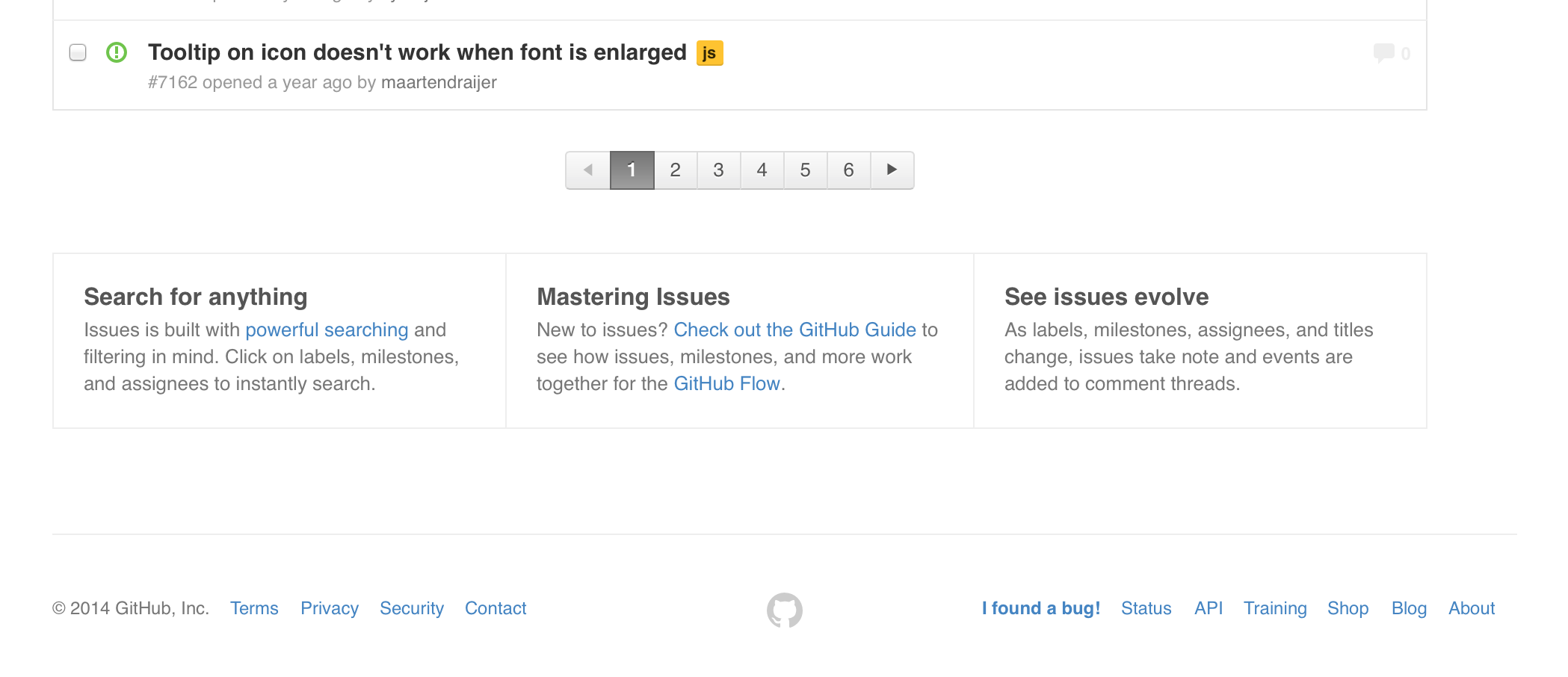
We ended up shipping a much more streamlined version of those at the bottom of the issues list. It was easier to work with, easy to ignore by more experienced users, and a fun surprise for those new to the feature.
Settling down
So, I went backwards again to the table header, narrower search button, and a closer subnav for the issues, labels, and milestones links.
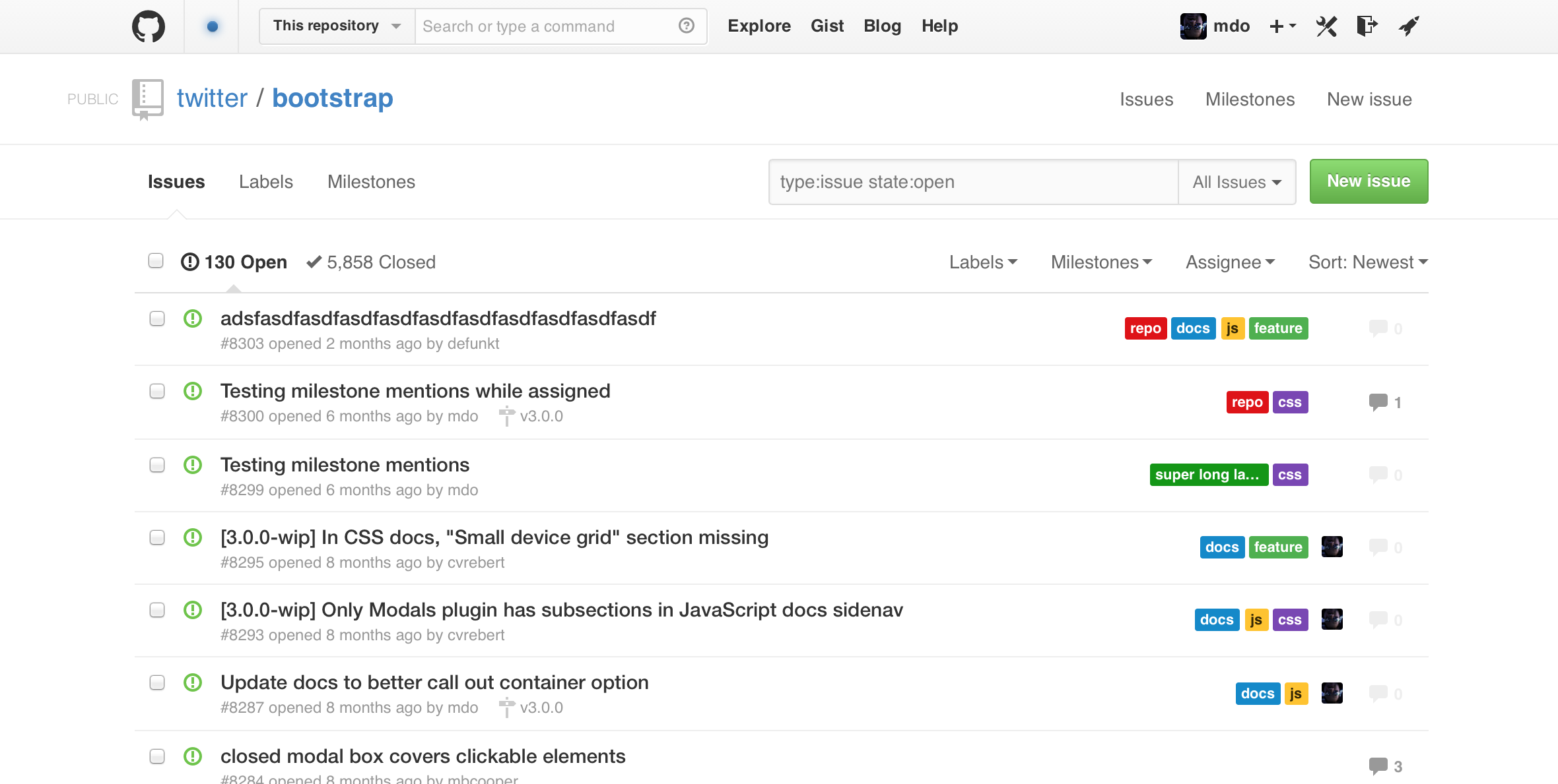
Instead of columns like some earlier iterations though, I switched to plain text “buttons” all right aligned above the issues list. Given that they weren’t typical button styles (gradients, box-shadows, etc), it felt lightweight and approachable.
There was a bit more churn around the subnav and issues list:
- Added a border around the entire list of issues and the table header
- Set the filters (open/closed, labels, etc) against a light gray background for contrast between chrome and content
- Tweaked the subnav styles, trying out gray text links, nav pills, and then ultimately a segmented controller style nav
- Search styles to clarify the proximity of the quick filters dropdown menu and new issue button
Even with those changes, this was basically the last big iteration we went through before shipping.
Validating our ideas
The thing about working on a single project for so long was how do we know when to stop? I struggled with this a bit. When you’re working for so long on something, you get tunnel vision and don’t want it to end. You keep telling yourself you’ve got time for one more tiny feature or one more UI change.
One day I noticed something though. Whenever I wanted to churn through some Bootstrap issues, I was disabling staff mode and reverting to the old issues interface. As it turns out, I wasn’t able to get any real work done with the current design.
So, that became the test for me. I’d know we were on to something awesome if I could binge close dozens of issues without using the old interface.
For some reason we never really got to do dedicated user research studies on Issues 3. We had plenty of time, but it never solidified. We did have tangential feedback from related studies, our sales team, ourselves, and our peers who we teased with early iterations.
Shipping it
The task of actually shipping Issues 3—after all the design and development was done—is mostly a familiar process to us. There were a few unique aspects for a ship of this size, but overall it went something like this:
- We finished off all our product work and shifted gears to the blog post, small bug fixes, etc.
- Given we had rewritten and improved much of our infrastructure, we had some basic production readiness reviews with our Ops folks (far too late in the process mind you, but it was better late than never).
- We dark-shipped it a couple times to more accurately simulate the changes in performance. (Dark-shipping refers to silently calling a new feature’s functionality in production alongside the existing functionality. This way, you get real metrics on how folks use the service for both versions.)
- When we were ready for it to go into “genpop”, we flipped the feature flag and redeployed to our servers.
- After watching the graphs in Chat for 10 minutes or so, we decided it was ready to go and merged into
master. Boom, it was shipped! - Once we shipped the code, we shipped the blog post and all our documentation updates that our support team had made. Without those last two, the whole ship is a bust as support requests become a shit show rather than what I like to call a coordinated chaos.
That’s greatly simplifying it, but I’m not trying to provide all the technical details. That’s way too much for this post. Suffice to say we had an amazing set of dedicated individuals and teams to help us ensure a quality ship.
Our Support team is always invaluable when it comes to shipping (big) features. They triage incoming feedback, bug reports, and the like so we can more efficiently react and quickly ship follow-up tweaks. I can’t stress enough the importance of that workflow to the success of this project.
Wrapping up
Issues 3 wasn’t without its problems, but we worked our asses off on it for months and the launch has been overwhelmingly successful. I’m sad I don’t have more metrics and user feedback to share, but we simply didn’t collect enough of it throughout the process. Next time, we’ll do even better.
And on that note, here’s to the next :ship:!