Shipping GitHub's split diffs
GitHub has been around for over six years, and in all that time there’s only been one mode for diffing code—the unified diff. Until yesterday, that is, when we shipped split diffs. Here’s how they look:
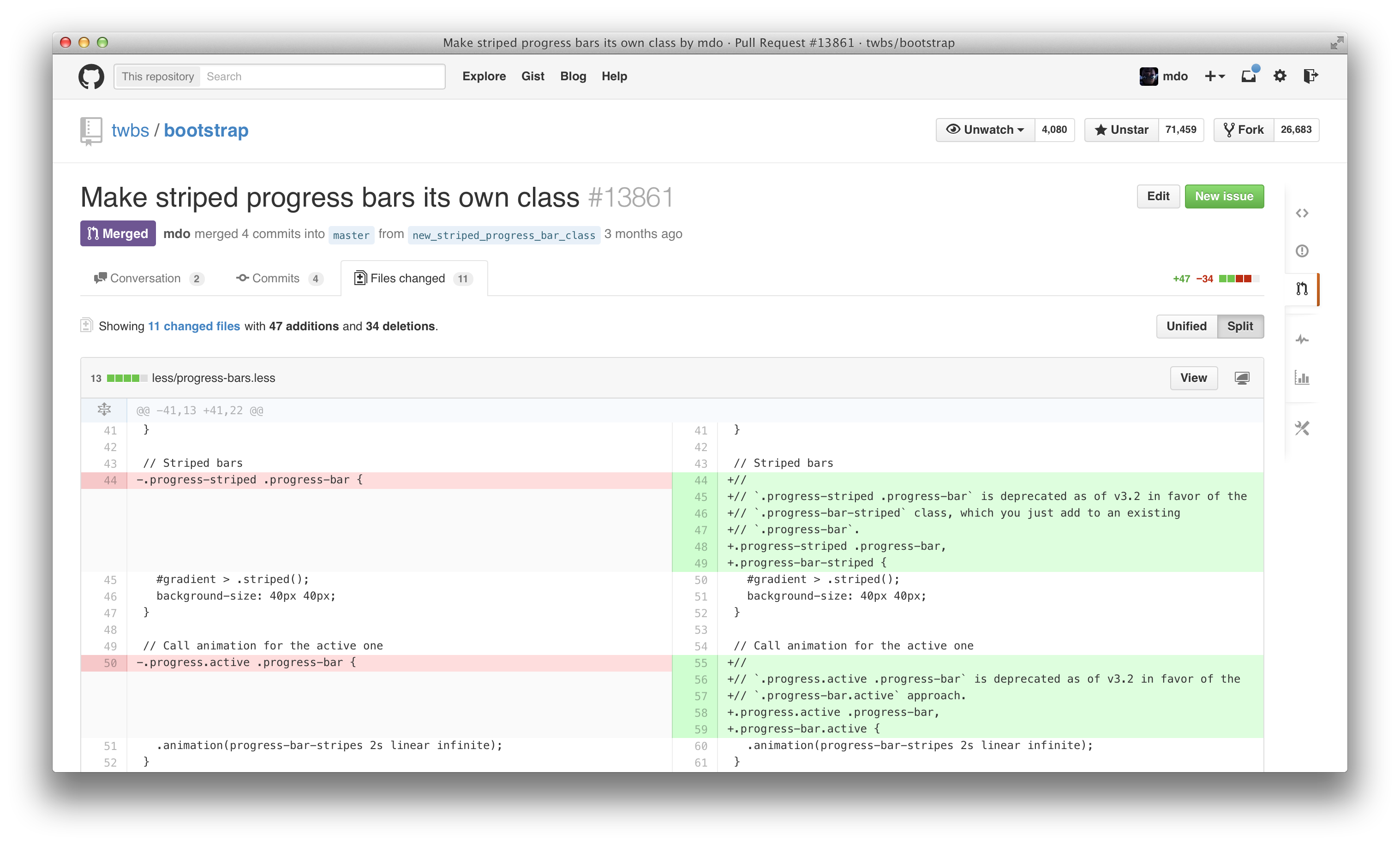
Similar to my post on shipping the new GitHub issues, I wanted to give some background on the how and why of shipping what until this week was our most requested feature.
Timing
For as long as I’ve worked at GitHub, there was an unintentional Hacker News tradition for every major feature we shipped. No matter the ship, we’d most assuredly get a comment like:
Neat. When are they going to do split diffs?
The general sentiment was surely it couldn’t take this long to build split diffs, so why didn’t we just done it already? Well, as it turns out, there were many great reasons why we couldn’t (or wouldn’t). To start:
- Many GitHubbers never really used split diffs, so they didn’t see much value in building them into GitHub. I can’t blame anyone for that—either you’ve used and loved them, or you haven’t.
- For the last two years, it was actually quite difficult to build. The code for diffs was quite complicated, all our JS depended on super specific HTML, and in general diffs were touchy on performance.
- Lastly, and perhaps most importantly, we never just add something for the sake of adding it, especially a feature that impacts so much of our core offering.
Having worked at Twitter for two and a half years before GitHub, I spent much of my time in Reviewboard, a fantastic but ugly and slow code review tool that used split diffs. When I moved on to GitHub, I definitely missed the functionality, and it became one of pie in the sky type of features I wanted to help build.
First prototype
Six months after I joined GitHub, I finally gathered the courage to attempt just that. Much to my surprise at the time, it wasn’t actually too bad to get started. Here’s what I ended up with:
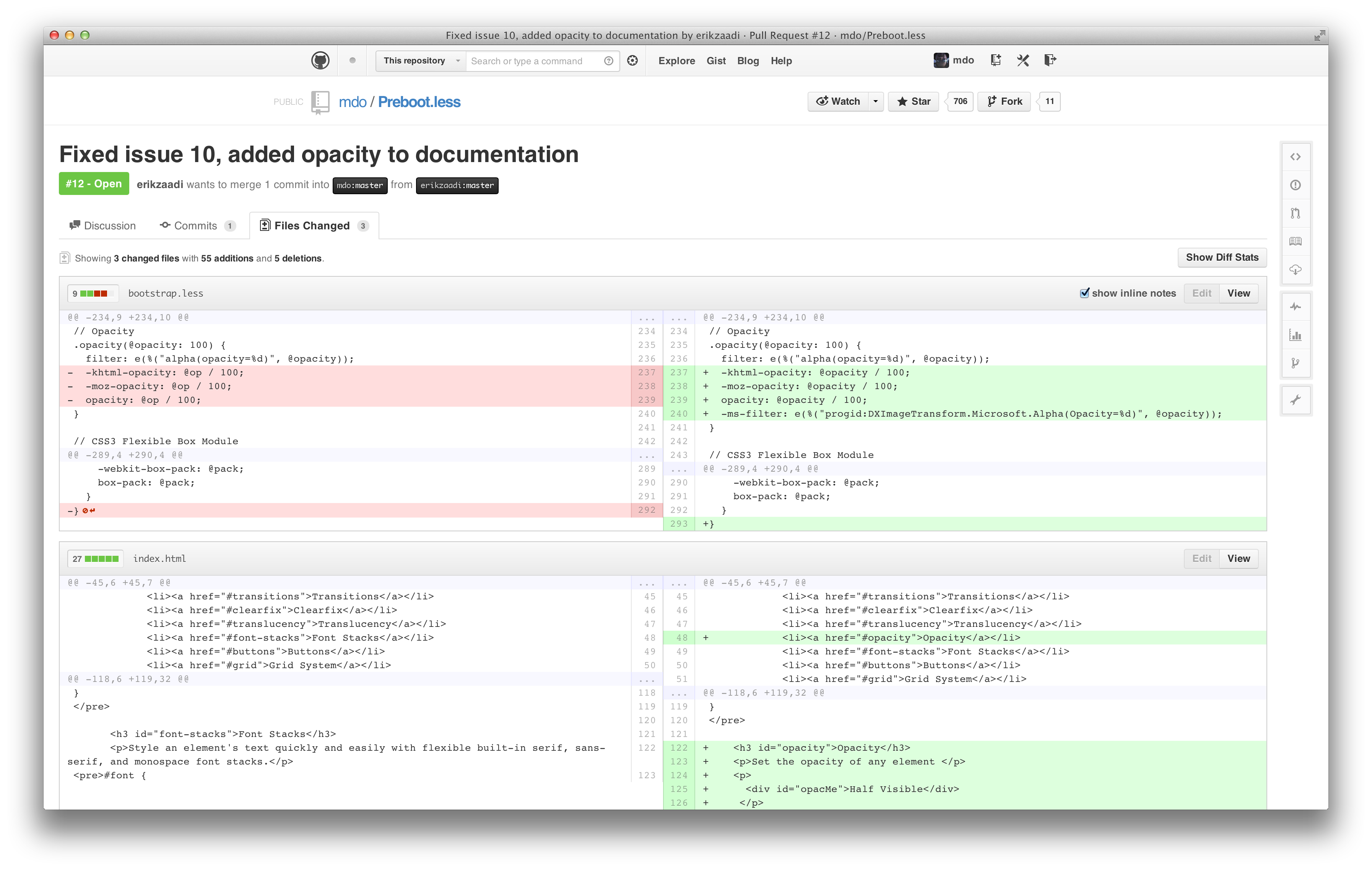
If you’ve ever looked under the hood of a GitHub diff, you’d notice we use <table>s to render them. Each line number and line of code is it’s own table cell. We use data attributes and JavaScript to handle line numbers and diff context expansion (showing more of a diff’s file).
Once I had a better handle on our diff views, and knowing they were <table>-based, I was able to see that the first and biggest step was to duplicate the existing code table cell. Then, I used some CSS-fu to collapse the “empty” cells on either side of the table.
Easy-peasy. Or so I thought.
Prototype ≠ production ready
Ultimately, none of it could ship. For a number of reasons, what I built 18 months ago was in no shape to be the underpinnings of a production-ready feature:
- We were increasing the number of elements on the page by at least 33% (three existing cells for unified diffs, four for split).
- Within those table cells there used to be a lot more markup. A
<span>around every line number, a<pre>around every line of code, etc. That all adds up. - This prototype didn’t take into account how to actually switch between unified and split diffs, or if we’d do that at all.
- It didn’t address diff expansion at all, and it turns out that code was completely dependent on the order of line number, line number, code for unified diffs.
- It didn’t address code commenting in the slightest. How would comments work—one side, both sides, something else?
- How would this impact the soon-to-be shipped prose diffs, which further complicated the diff code?
It just wasn’t going to happen without some serious and dedicated developer help beyond my limited abilities. Once I realized that, I gave up and moved on to other things. No one else really picked it up from there, and I think I have an idea why.
At the time, nothing shipped without a pull request and dedicated developer to push it through. I had a branch, but never opened a pull request for it. Given that, I think folks assumed I’d finish it eventually, and so no one else jumped on it until I did again 18 months later.
Today, the process for proposing and shipping a brand new feature are much better. We have a loose product roadmap, folks in leadership positions, and a better ship list. This new process is part of why split diffs shipped so quickly.
Take two
Fast forward to two months ago. We had just finished putting together a first pass at a more formal roadmap and split diffs were on the list. The exact details of the feature were still up in the air, but it was just enough pressure to kickstart things.
Given I was the last to prototype it, I started in on split diffs once more with a fresh branch. After a couple days I had another working prototype that was rather similar to the first:
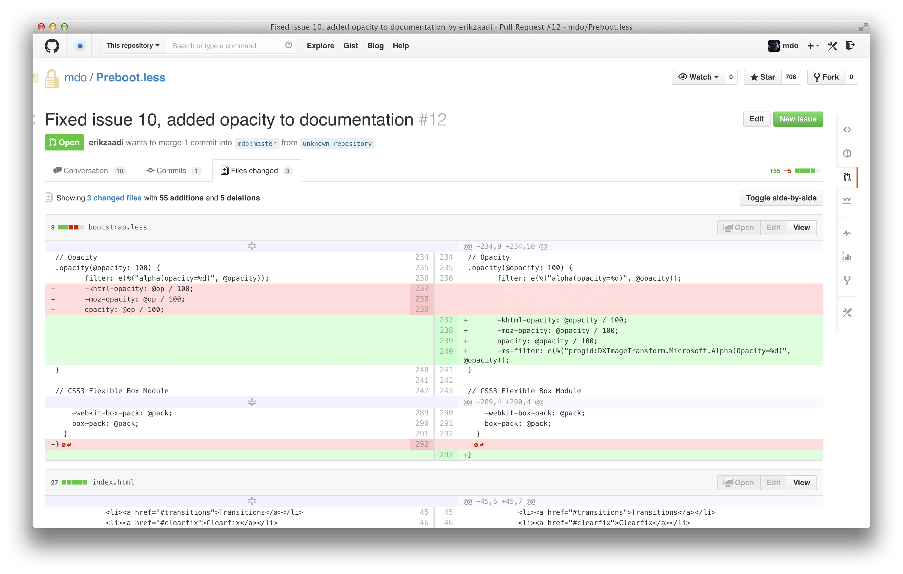
This time though, I pushed the branch and opened a pull request. I pinged a couple folks and got a developer assigned to the project. Three weeks, 65 commits, and two contributors later my hacky second prototype turned into a staff shipped feature.
Hell yeah.
Road to shipping
With that initial staff ship, we knew we were on the right track, but we had plenty of work to do before we could ship it to everyone. We had to refactor a lot of code and redesign a few key areas of the site to pull it off.
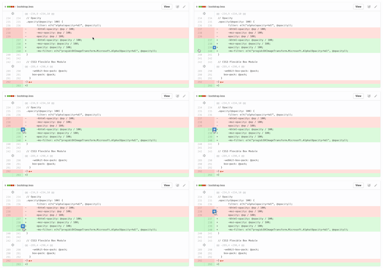
I redesigned the “Add line comment” button to overlay the line number and code instead of overhanging on the edge, since we needed to go full-width for split diffs and a hanging icon on either side wasn’t going to cut it. It also provided an opportunity to clarify click areas throughout unified and split diffs.
In addition to the refresh of the UI components, the JS for line commenting and diff expansion was completely overhauled so that it’d work the same across split and unified diffs.
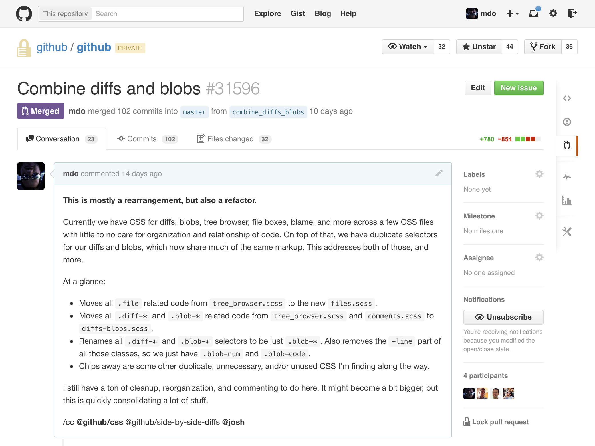
We rewrote a ton of code for this, and it was all for the better honestly. On the HTML/CSS side, I refactored the code blobs (static files) and diffs to share more code.
Previously, blobs were two table cells, one for all line numbers and one for all code lines. After the refactor, blobs and diffs were using the same table approach: one row for each line number and code cell.
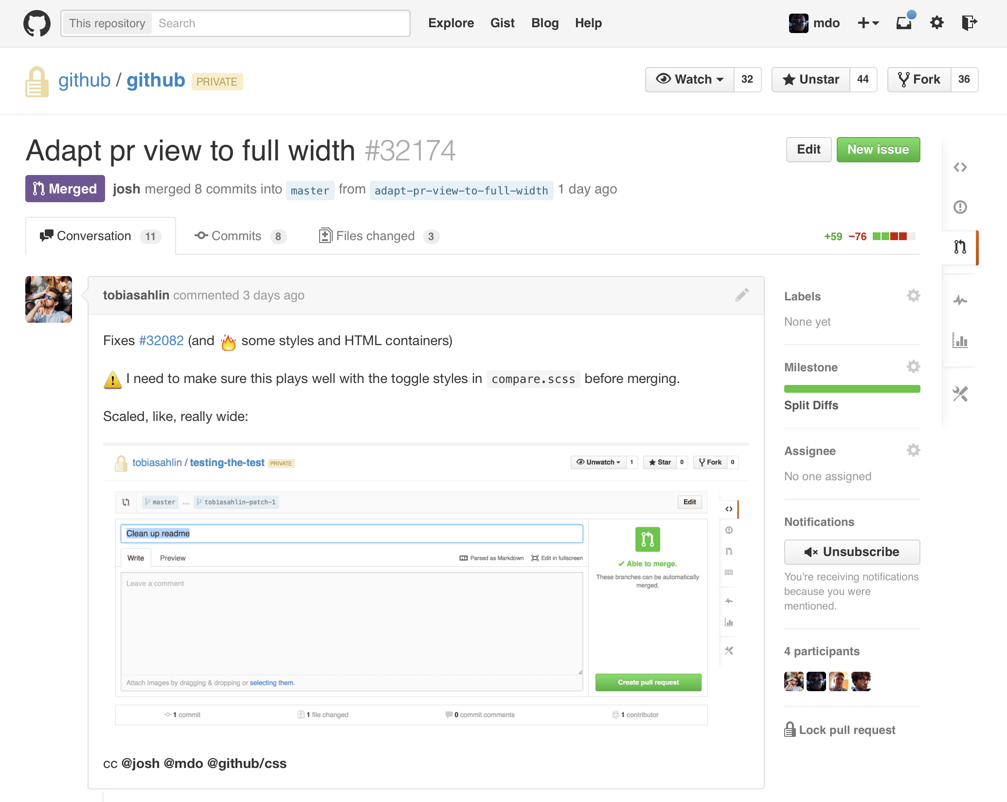
Figuring out how to break the entire site’s layout on just a handful of pages was a bit of a challenge. For most views it’s as simple as removing a fixed width and adding padding. However, in other areas like the pull request composer above, we needed to do some refactoring to avoid nested fixed widths.
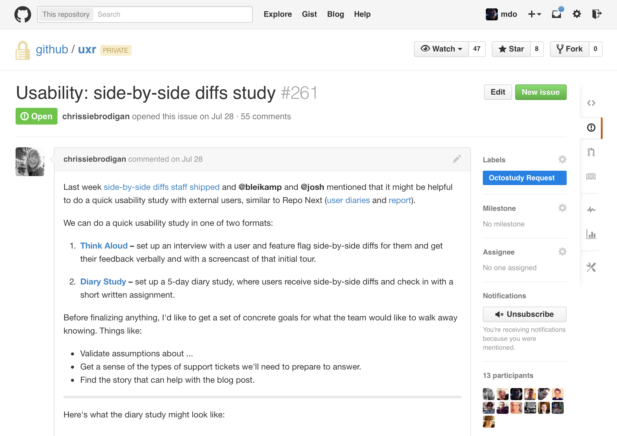
We also conducted several casual user studies to gauge folks’ reactions to the interface, verbiage, performance, and more to verify our gut calls on how to build a “GitHubby split diff” feature. Ultimately the folks we talked to confirmed our own hunches—ship it!—and lined up a ton of next steps for us.
Wrap up
I purposely avoided talking about a few aspects of this project, but hopefully what’s here gives you a good idea of what went into designing, developing, and shipping split diffs.
A number of things were punted so we could ship as fast as possible. To name a few, we still need to polish up the transition from fixed-width to full-width across the site and there are some bugs around composing comments and switching diff modes.
Bottom line? In exactly two months, we went from my pretty shitty pull request to a fully fledged, shipped feature. That’s simply astounding to me given the scope of changes. I’m super proud of this first step and the team. I’m stoked for what’s next.