Simple GitHub.com userstyle
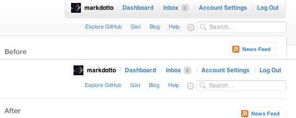
GitHub is awesome, amazing, and wonderful. It’s one of the best things that has ever happened to me as a designer and developer. However, I find myself distracted by the background images and styles of the topbar and struggle to skim boatloads of issues on Bootstrap. So, I added a custom userstyle in Chrome to help me out.
The userstyle
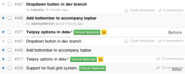
The header and body changes are purely cosmetic changes based on personal preference, but the change to the issues list helps me work a bit more efficiently on Bootstrap. I hide who submitted the issue and when and unbold the issue names. This way I can see more issues at once and get a larger, bird’s eye view.
Updated topbar

Updated issues listing

Download on GitHub
Check it out and fork it on GitHub Gists if you like.
If you’re using Google Chrome, I recommend using Stylish to add userstyles. For Safari, I recommend User CSS.