Shipping system fonts to GitHub.com
I’m finally publishing this blog post I drafted over a year ago. It was incomplete when I started to revisit it months ago, but I figured it’s better to share it now than sit on it forever. I’ve called out the additions and edits I made since that original draft. Some details are fuzzy, but the core remains intact.
Last week July, GitHub.com received a slightly updated design featuring more modern fonts. Instead of showing decades old fonts that don’t take advantage of newer, high DPI screens, or dynamic font rendering, we now try to serve the best font possible based on your operating system or device. Awesome!
This posts explains why we made the change, how we coded and tested it, how we shipped the new fonts, and what we’ve done since initially making the move.
Before and after
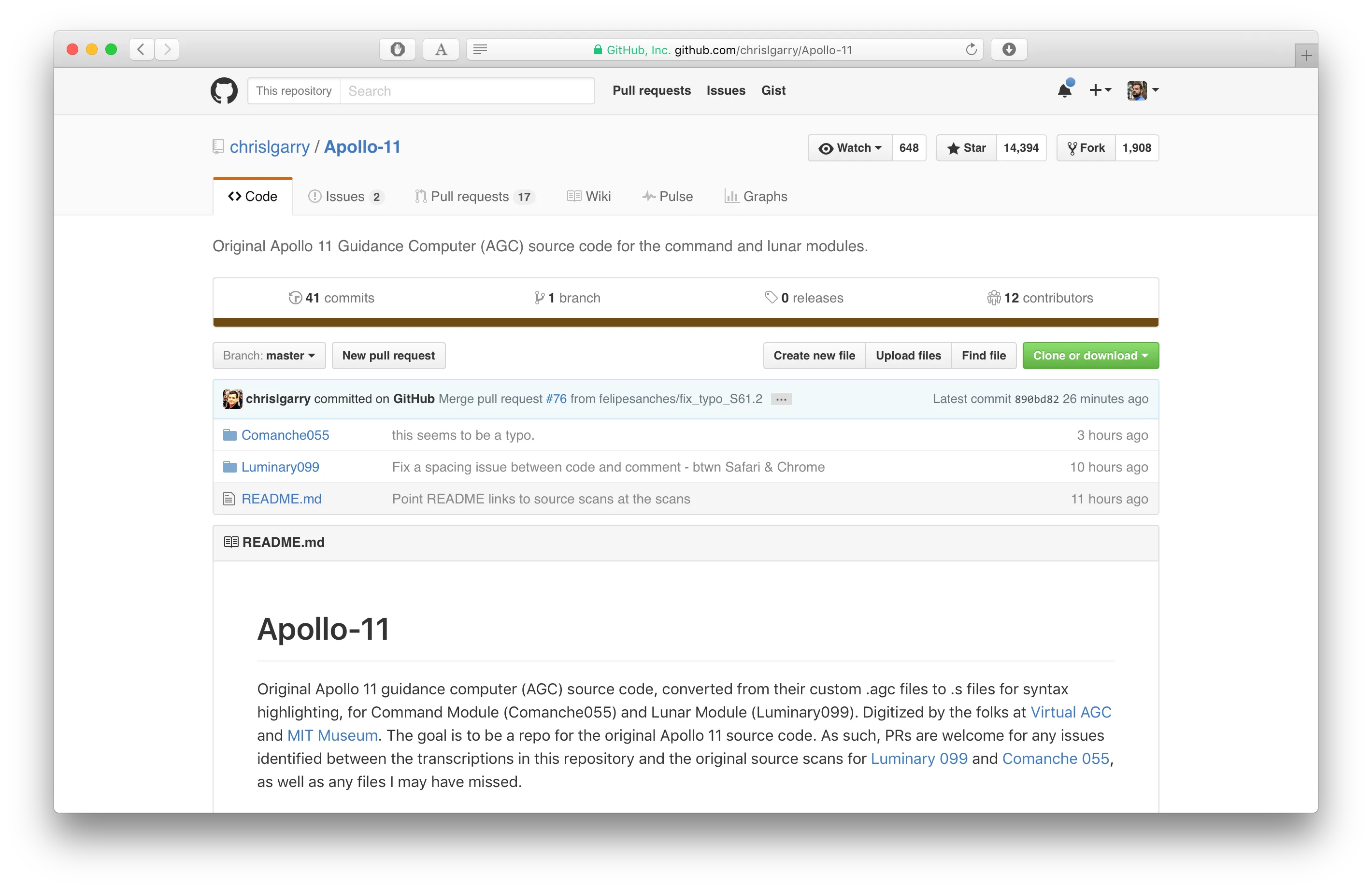
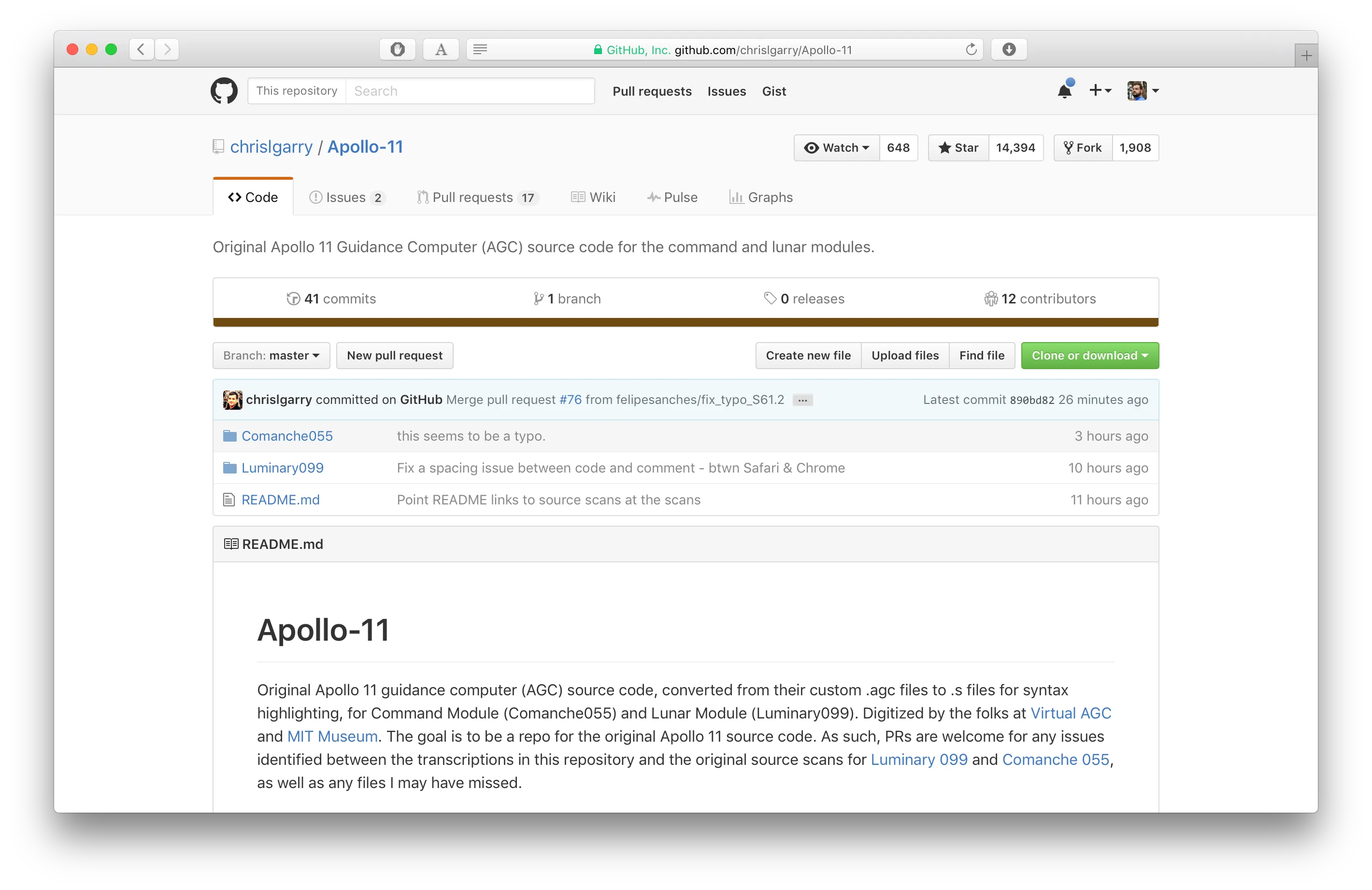
Before we dive into the why, here’s a quick comparison of GitHub on macOS before and after the font change.
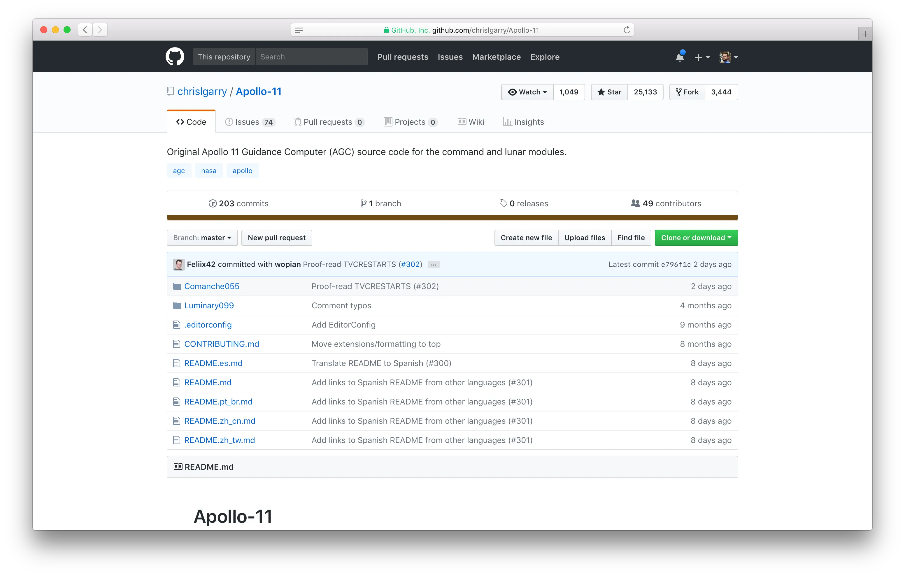
And now, with the dark header, color changes, and multiple product ships over a year later.
Why change
Our old font stack wasn’t exactly broken, but it was decades old. That stack featured Arial and Helvetica for Windows and Mac users respectively. Helvetica was created in 1957 when the personal computer was a pipe dream. Arial was created in 1982 and is available on 95% of computers across the web. Millions, if not billions, of web pages currently use this severely dated font stack to serve much younger content to much younger browsers and devices.
As display quality improves, so too must our use of those displays. System fonts like Apple’s San Francisco and Microsoft’s Segoe aim to do just that, taking advantage of retina screens, dynamic kerning, additional font-weights, and improved readability. If operating systems can take advantage of these changes, so too can our CSS.
Speaking of which, the saying goes that the best UI is no UI. With system fonts, page content can feel more like it belongs on your particular computer or device. Pages on my iPhone rendered in San Francisco feel more like a page made just for my iPhone, and I know from experience when I use my Nexus, I feel the same with Roboto there.
What’s changed
While the move to the system font families is quite obvious visually, we (a combination of product designers and web designers before our Design Systems team was formed) shipped a few other changes.
Here’s what’s new:
- New fonts in our global
font-familyfor the “system fonts” approach. - Larger base
font-sizefor all pages, moving from13pxto14px. - Improved type scale with clearer and more consistent heading sizes, weights, and line heights throughout.
Together, these changes have given us a much easier to read site and a stronger, more considered system to build on moving forward.
The stack
The new GitHub font stack has a handful of system fonts, plus some extras as fallback and emoji. Developers love their emoji like anyone else—maybe more.
font-family: -apple-system, BlinkMacSystemFont, "Segoe UI",
 Roboto, Oxygen, Ubuntu, Cantarell, "Fira Sans", "Droid Sans",
 "Helvetica Neue", Arial, sans-serif,
 "Apple Color Emoji", "Segoe UI Emoji", "Segoe UI Symbol";
This font stack has since been updated and iterated upon:
font-family: -apple-system, BlinkMacSystemFont, "Segoe UI",
 Helvetica, Arial, sans-serif,
 "Apple Color Emoji", "Segoe UI Emoji", "Segoe UI Symbol";
Here’s the rundown on what was originally included and what’s changed since we made the changes over a year ago:
-apple-systemandBlinkMacSystemFonttarget default fonts in Safari and Chrome on macOS and iOS.Segoe UIis explicitly named for all browsers on Windows 7+. Friendly side note, our Windows audience is either on Windows 7 or Windows 10—hardly anyone is on 8.x.Robotois for Android and ChromeOS devices.- As fallback, Helvetica Neue and Arial are included. Fun fact, regular Helvetica is actually aliased to Arial in the Windows registry, so you’ll never get regular Helvetica there anyway.
- And lastly,
Apple Color Emoji,Segoe UI Emoji,Segoe UI Symbolensure that we render the best emoji possible on macOS and Windows.
As you can see, we originally had a few more fonts in there, but after shipping, we heard a ton of feedback from users with browsers, operating systems, and font settings we didn’t anticipate. This included Roboto, Oxygen, Ubuntu, Cantarell, Fira Sans, and Droid Sans. Interestingly enough, Linux users were the most upset at the change given Linux system fonts seem to be rather large and clunky, and their system fonts so inconsistent across distros.
Dealing with Chrome
Rather surprisingly, we’re well over a year past this original bug report and Chrome still doesn’t have this issue resolved.
Turns out Chrome has fixed this with v64! Huzzah!
Sadly at the time of writing this, Chrome still hasn’t resolved a bug in how they render San Francisco in macOS. You can follow the history of it on the Chromium bug report.
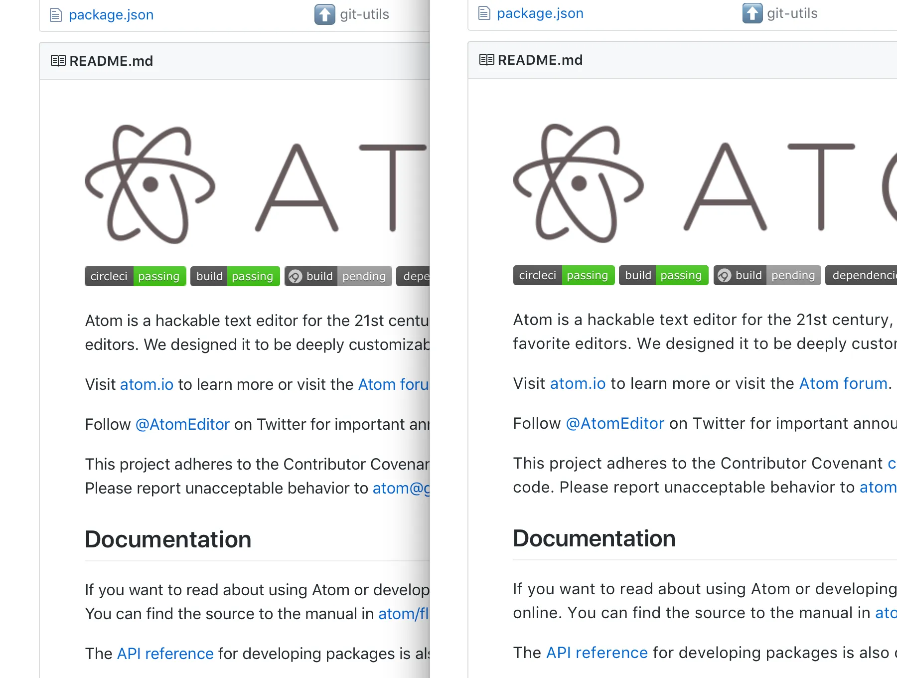
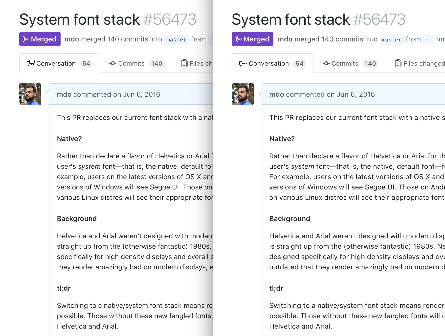
It’s subtle, but it’s definitely noticeable, especially when moving between other macOS apps and Chrome. Rather than utilizing the adaptive kerning of the new Apple font, Chrome applies a generic spacing multiplier across the entire font. This isn’t as noticeable for the SF Display variation of the font (which normally kicks in at 19pt and above), but it is obvious with the SF Text variant for body copy. Note how in the above screenshots the text wraps at different points.
It’s definitely a bummer to see this bug stick around given so many of our website’s visitors are on Chrome. It’s at least somewhat good that Windows Chrome users outnumber the Mac ones, though!
How we did it
Rolling out code changes on GitHub can happen in a handful of ways, but for any sufficiently large project, we use feature flags to help. These flags allow us to enable a change on a per-user, per-team, per-organization, or per-repository basis with ease. It also allows us to “staff ship” something to every GitHub employee—this is how we chose to roll out the system font change.
These feature flags are made accessible in our views, controllers, and more through a small Rails helper. (GitHub is one big Rails app right now in case you were wondering.) In our case, we had the system_fonts feature flag attached to a system_fonts_enabled? method. In practice, this allowed us to conditionally load an additional stylesheet that reset the font-family, provided our font-size and line-height adjustments for the new fonts, and housed any component-level overrides to ensure the font changes didn’t break anything.
<%= stylesheet_bundle “system-fonts” if system_fonts_enabled? %>
Creating that stylesheet and it’s conditional inclusion was the quickest part of the entire project. Once the new font-family was included there, we started browsing pages to see what was broken. That entire workflow really sucks in hindsight, but we don’t do visual diffing at GitHub (no reason why really) and it was the most straightforward path.

As we found things that needed fixing, we put overriding styles in that system-fonts.scss stylesheet with clear comments to explain why the override was needed. Here’s a snippet of what became a ~300 line stylesheet.
body {
  font-size: $body-font-size;
  line-height: $body-line-height;
}

// To ensure text resides vertically right in the middle of our buttons, we bump
// the line-height to 1.6. Otherwise, the button will be an odd-pixel height and
// text will appear to sit too low.
.btn,
.form-control {
  font-size: $body-font-size;
  line-height: 1.6;
}

// Forms need to have their padding match buttons otherwise they're different
// heights when placed inline with one another.
.form-control {
  padding-top: 6px;
  padding-bottom: 6px;
}

// Specificity wars; undo the above override so it doesn't fubar our header search.
.header-search-wrapper,
.header-search-input {
  padding-top: 0;
  padding-bottom: 0;
}
Those code comments were super important early on as this override file was temporary from the get-go. It ensured the work we’d do later to remove this file was as smooth as possible and would ideally even lead to less CSS than when we started.
After we shipped the change and merged it all into master, we had did whole iterate-with-customer-feedback–and–clean-up-the-code dance. We adjusted the font-family and slowly started to move those overrides back to their original rules in our existing stylesheets. This was more problematic for some overrides than others, but in addition to removing the system-fonts.scss file, it led to a good amount of general CSS cleanup.
Before shipping, we staff shipped the font change to all GitHubbers to let it sync in and try to catch as many bugs as we could. We left it in staff mode for two weeks, making additional tweaks here and there before rolling it out to all our users.
One year later
My original draft of this post ended with the above section. Now, over a year later, I can add more context, talk about the iterative updates that went into the typography of GitHub.com, complain once more about this ridiculously old Chrome bug, and hype our Design Systems team.
Near the beginning of 2017, we made a few other design changes to GitHub.com. Within a PR for that, I snuck in one more font change—adding SF Mono to our monospace font stack. It was a subtle change, but a good one for those who could benefit from it. Until the San Francisco fonts, no one on Mac or Windows had a shared sans-serif and monospace font experience. It’s small, and most folks likely don’t care about it, but it was cool to be able to merge that change six months later and complete the picture for macOS system fonts. Maybe we can help Windows and Linux soon!
Several weeks after making the SF Mono change, we also looked into shipping an update to the font stack to clean up some of those browser-specific aliases. We merged the change after some quick testing and assumed everything was going to be spectacular. Thankfully our users are always quick to notice problems and were quick to point out to our Support teams that the new system-ui alias caused issues in WebKit and Blink browsers with non-English languages. We reverted the change back to the previous version and haven’t touched it since.
After our Design Systems team officially formed up earlier this year, they continued to iterate on the code and documentation side of our typography. Making the change to the font stack and their various font-size/line-height pairings was only the beginning. The team stepped up and overhauled all our Sass variables and mixins, and then documented it in our new upcoming style guide. Since making those changes, they’ve also heavily overhauled our CSS toolkit, Primer, to better organize all our CSS, including typography, for easier usage across other properties. As such, we were able to easily put our system fonts in more GitHub web projects, too. Woohoo!