Shipping Blended Diffs
It’s been a whopping five years since I last shipped one of my Shipping blog posts, and boy do I have a good one to come back with. I’ve been working on Pierre for most of the last year and we’ve been shipping some amazing stuff.
Let’s talk about the latest, designing and shipping blended diffs in Pierre!
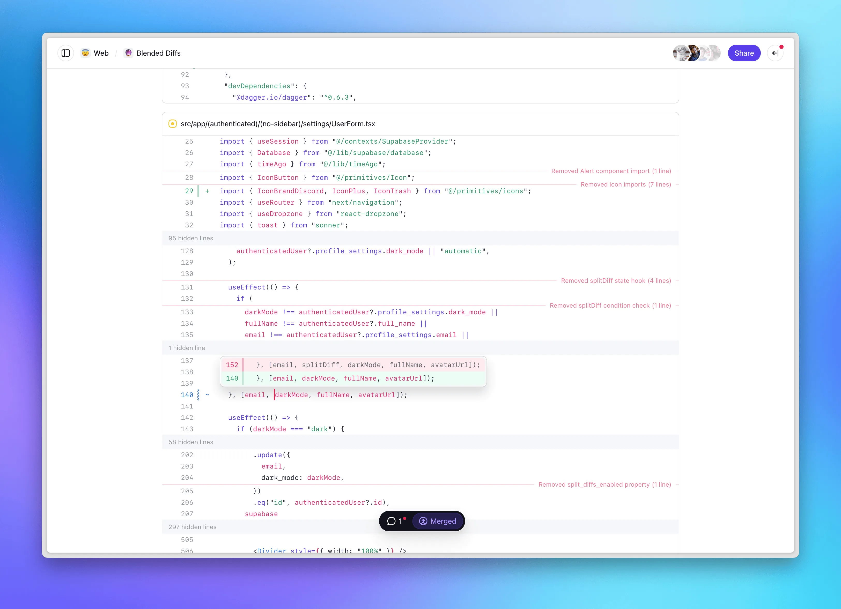
Since starting Pierre, we’ve been focused on finding ways to rethink the tools and features we’ve relied on for decades as developers. A few months ago, I decided to do a deep dive into how we can render code changes differently. Just a fun and open-ended exploration in Figma of any and all ideas that came to mind. Most of my Figma files end up looking something like this:

And since designing diffs and code changes is an area I’ve thought a fair amount about since first shipping split diffs at GitHub back in 2014, I was very excited to dive in.
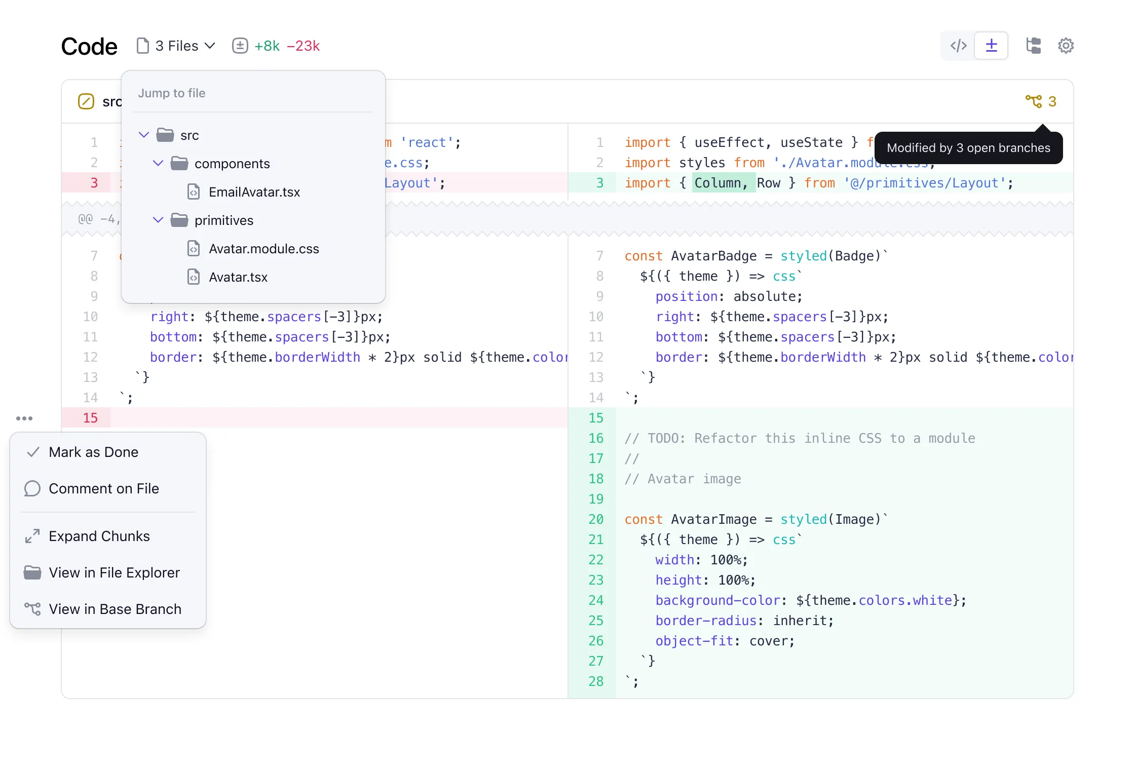
Most of my early explorations like the one above started by adding features to our diffs and reviews, which quickly started to feel like the wrong approach. Instead of adding a bunch of new or improved stuff—which, honestly, we still want to do at some point—what would happen if we started by trying to remove bits and pieces? That’s ultimately what led me to something I started calling blended diffs.
Finding a new style
Blended diffs are an all new diff style that emphasizes a file’s finished state, minimizes deletions, simplifies one-line modifications, and creates more space for context. All in an effort to decrease review time and make code changes more approachable.
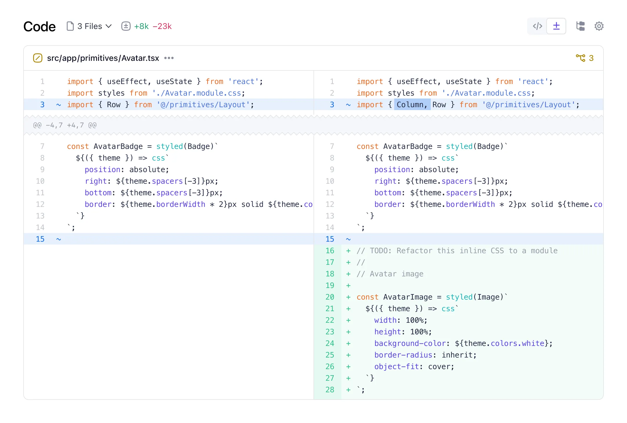
This was the first iteration of a new “modified line” treatment where I treated the 1-line diff as just that, one line with an inline change. Until this point, single line changes show up as two lines of a diff, like this:
- This is the deleted line
+ This is the new line
And this started to really bother me because I spent more time looking at the two lines rather than the one-word inline change. Newer diff tools of course have added inline highlighting to help with this, but it was still the same thing at heart. So I kept pushing.
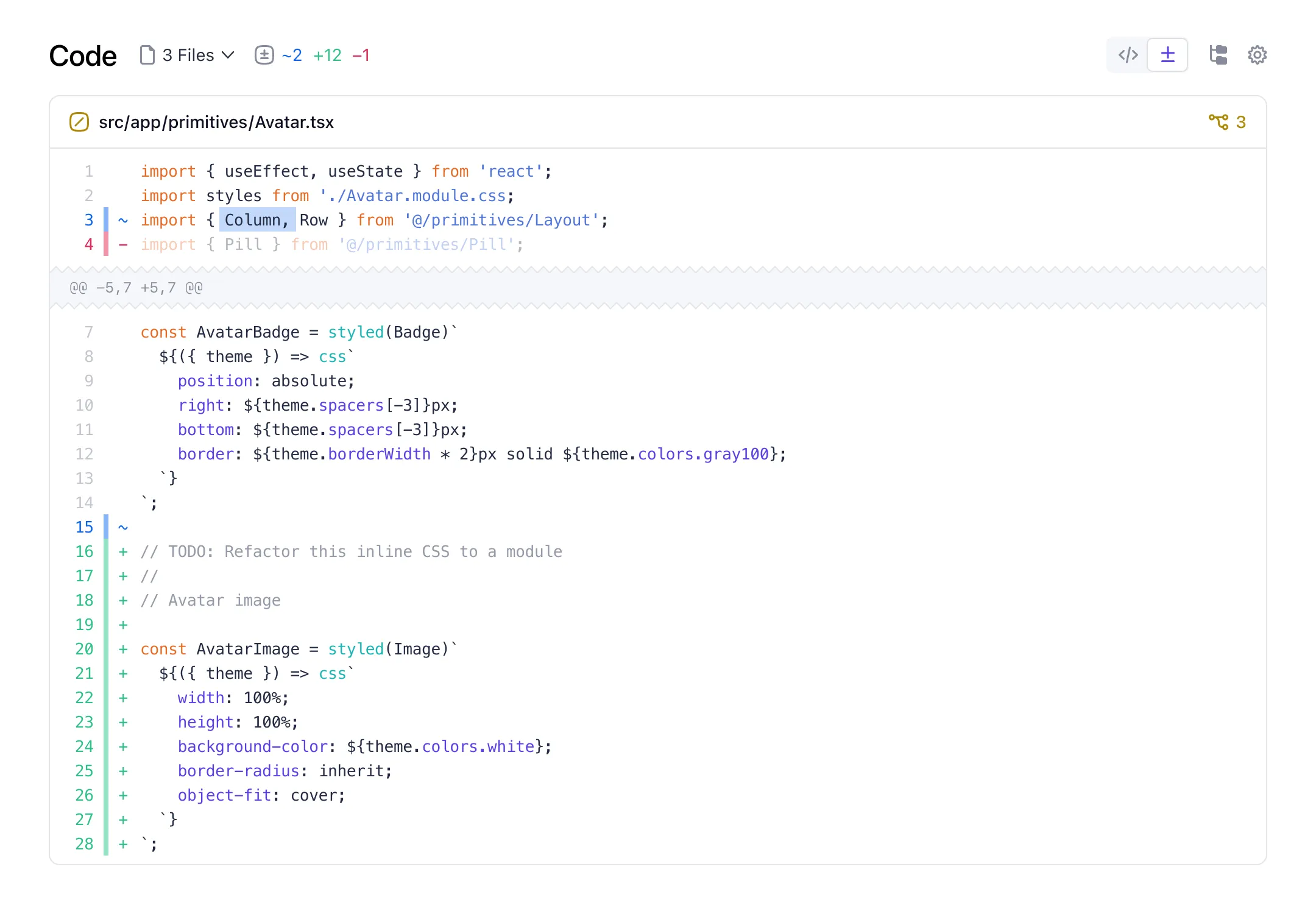
The very next iteration dropped the notion of a split or stacked diff, instead blending the changes inline with the rest of the file. See what I did there? I was still stuck on all blue here, which I quickly realized wasn’t ideal as it’s unclear if the change was a deletion or an addition. Several iterations later, I landed on a balance of those blue modified indicators and green or red inline treatments.
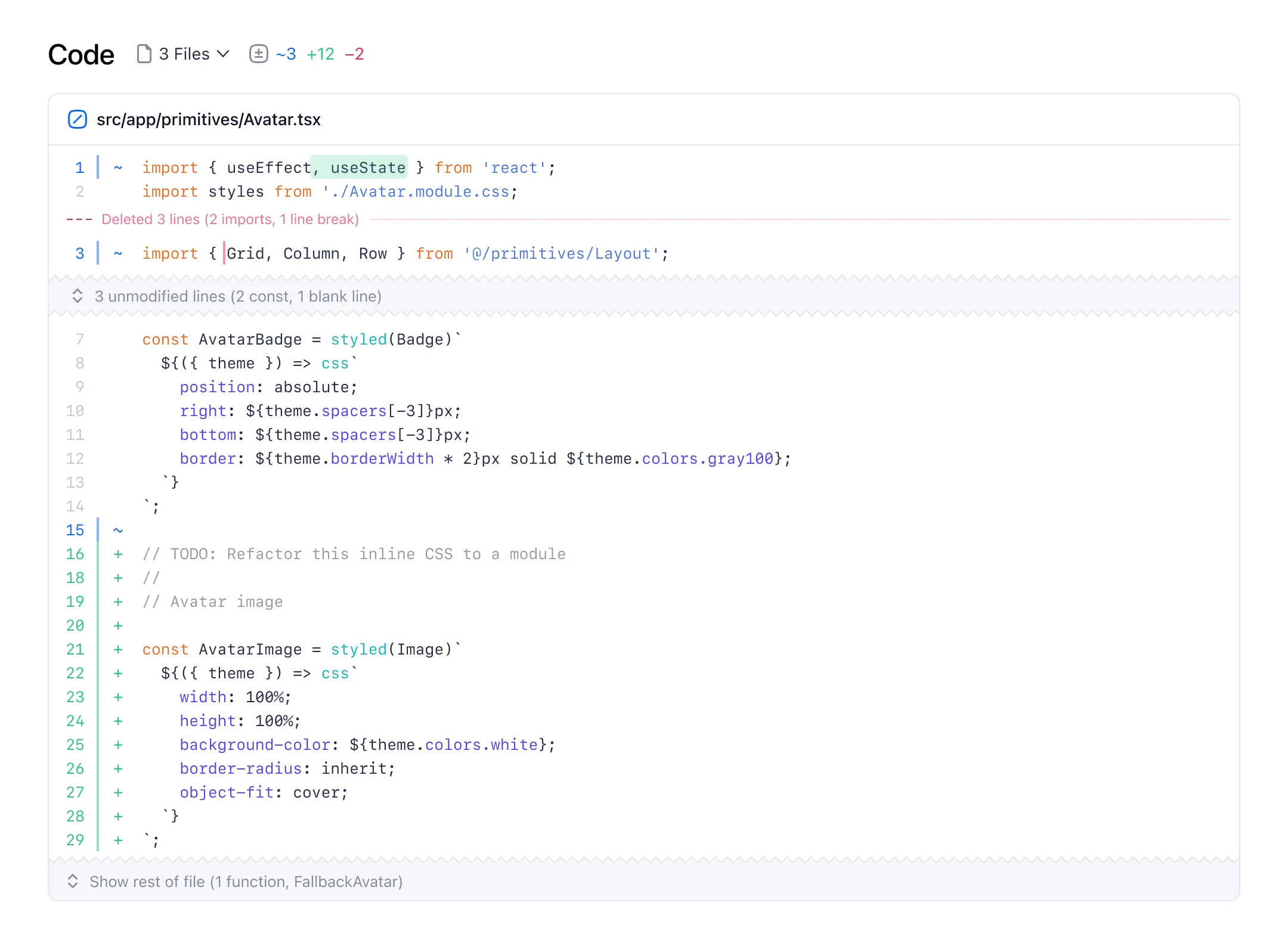
Clicking on the red bar for deletions would toggle a popover to show a regular diff.

This iteration also included the first ideas for inline summaries of deletions and hidden lines. The dream was to show the number of lines and a semantic summary of what was behind that hidden deletion. For example, 2 constants, 1 line break or 1 unused Button function. Originally this was going to be something I planned to push for down the line, but once we got into code, we switched gears on that once we got to building it.
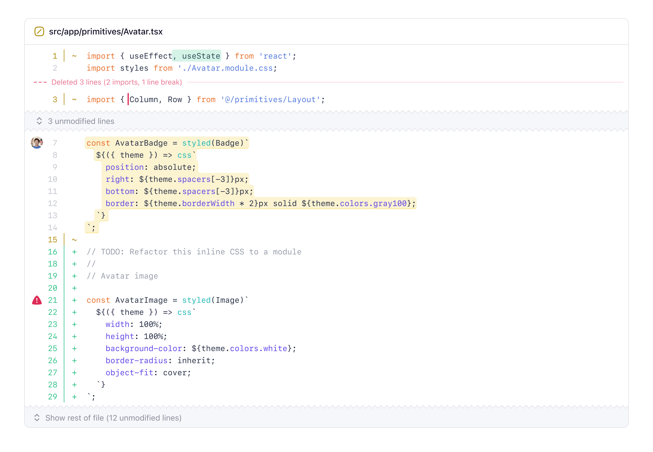
One of the last elements of the new blended diffs was a column left of the line numbers. I really liked the idea of a left-hand column called “the gutter”. The blended diff gutter is a consistent space for context on any line—annotation markers, avatars for comments, and eventually even more. I see this scaling to more custom annotations, like todos or linters, and whatever else we can dream up.
Planning with the team
As the design iterations started feeling better and better, it felt time to get out of Figma and write down my thoughts to better articulate product direction and get some early feedback. Writing about a feature is arguably more powerful and meaningful than just designing it.
Our team likes to spike out our ideas and then gather our thoughts before we fully (or over) commit to something. We built that right into Pierre with branches—you can start writing and getting a review before pushing any code.
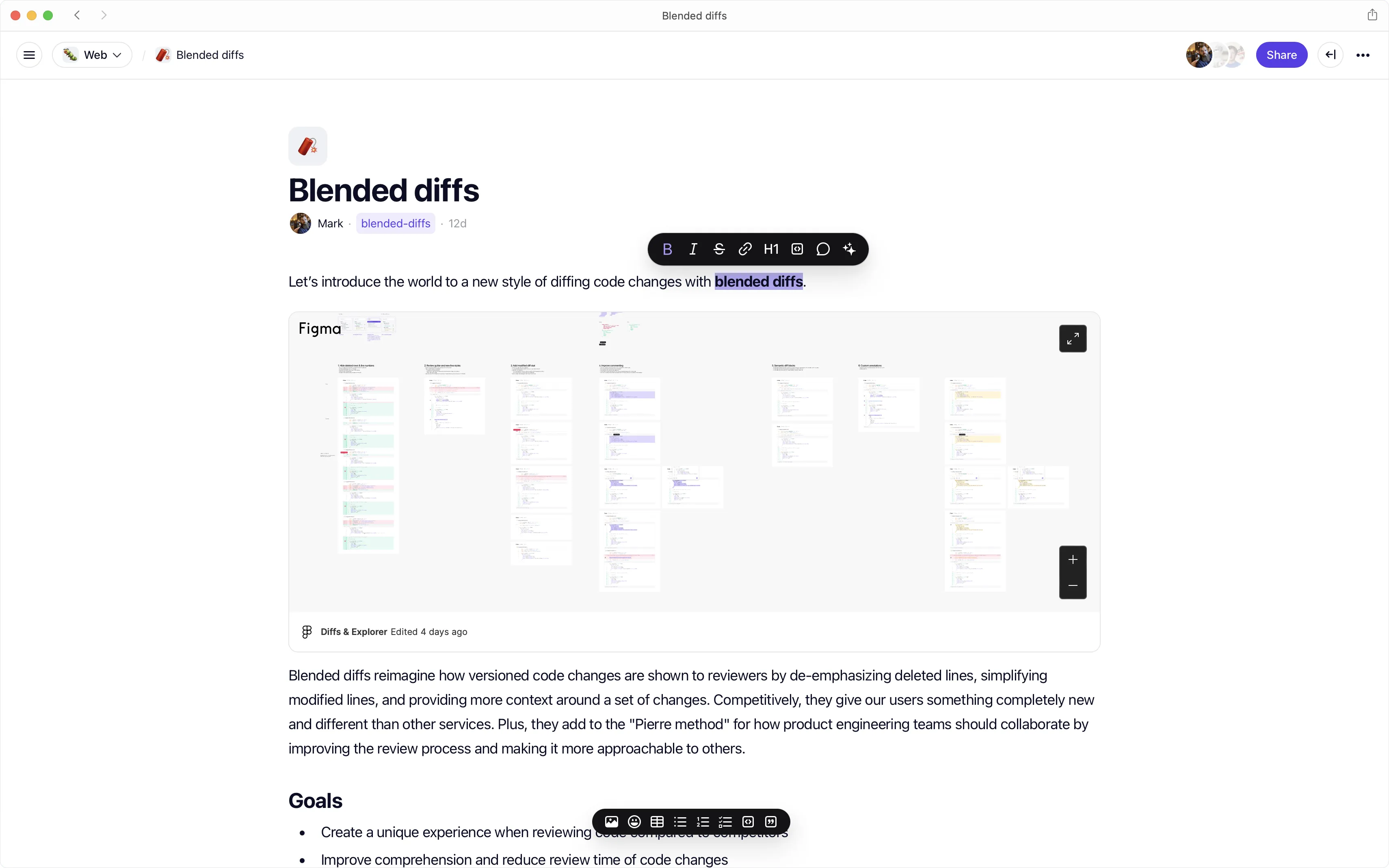
The biggest question sparked by the PRD was how to launch this new diff style—alongside stacked and split, in place of one, or in place of both? Adding a third diff style would be the safest. Replacing one of them would be a little risky. Replacing both would be making a bigger bet. So after some back and forth, we went big.
Blended diffs would replace both existing diff styles—making for less code to maintain, less bloat, and a more opinionated product.
Building it
After getting a clear direction set in stone between design and PRD, we started building. We went back and forth between more rounds in Figma and writing code, a process I really love when working with a product engineer. There’s no better way to fine-tune the details than to ping-pong between design and code, and designer and engineer.
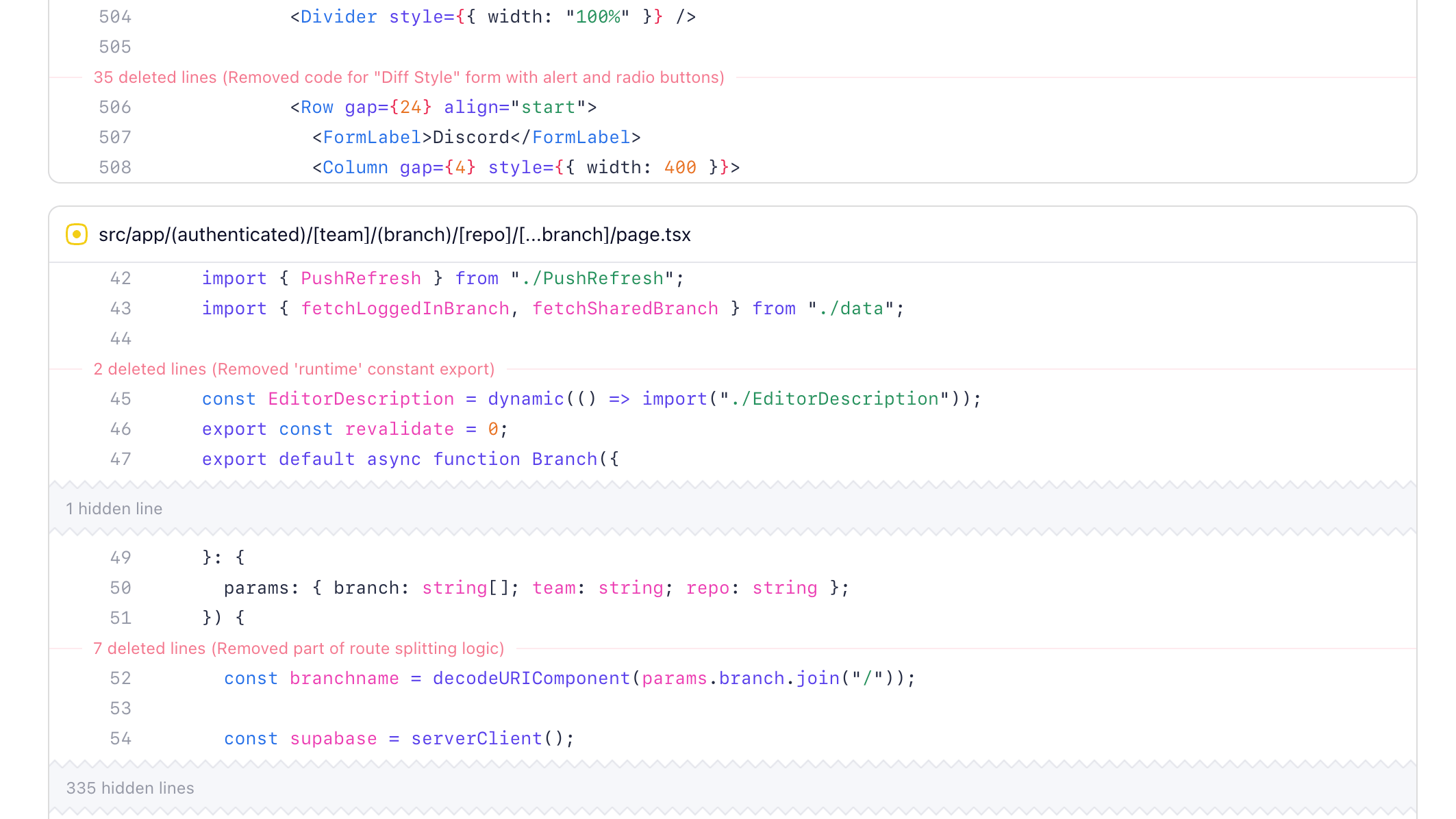
Ian led the charge on building out blended diffs while I provided some frontend support. It ended up being super helpful to be dropping the old diff styles because it was significantly less code to be working around. Our stacked and split diffs naturally shared some code, so adding a third was going to be messy. Making that early bet let us move much faster.
Design-wise, we started with the inline deletion summaries on the left and intersecting the line numbers. This felt too busy once we tried using it, and leading with the number of lines instead of the summary felt like we were burying the lead. We ended up moving the summaries to the right (on desktop) and leading with our AI generated summaries. This has the effect of you noticing a subtle indicator that there’s a deletion, and then you can choose to dig in or not without it taking away too much attention.
Jacob hooked it up so that deleted lines are fed into an AI model to summarize the deletions for us on the fly (and then cached). We experimented with summarizing more parts of the diff, including every line of every file, but that ended up being less accurate and obviously slower and more expensive. We also took some time to fine-tune the spacing and style, ensuring those hidden deletions didn’t interrupt the flow of the lines of code too much.
While we were in there working on the new diff styles, we also took some time out to further minimize deleted files. Now the stuff you don’t need to see as much—like a list of deleted images—can be collapsed to save space, reduce review time, and further improve comprehension.
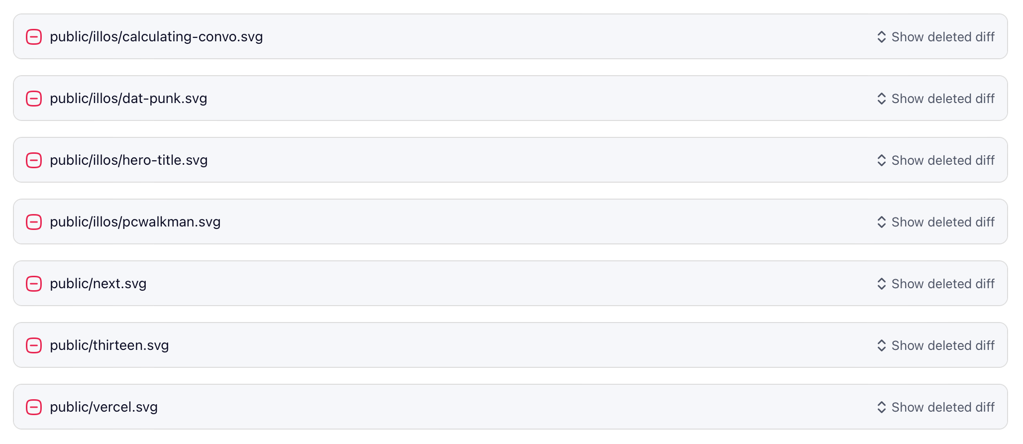
The same treatment also now applies to very large diffs, like package lockfiles. All minimized and tucked away until you really need to dig in. We really focused in on the idea of comprehension with blended diffs. If we could help people understand what happened faster, and remove the noise, we could make code reviews faster and more enjoyable independent of any other workflow improvements.
Building like this took longer than expected given the holidays, but the extra bake time really helped us hone details around style, interaction, and performance as we continued to use it internally. It also helped a ton that we have super easy and Pierre-native comments for our Vercel branch deploys—the engineers could just screenshot a visual bug for me and it’d show up for me in the branch to fix.
I can’t say it enough times—product designers and product engineers pairing from design to code is absolutely essential to great products. I’m super proud and thankful to be working with this team and building something like Pierre.
A diff canvas
There are like a dozen more ideas we landed on while working on blended diffs, but I don’t want to tip our hat too much before we’re ready. We’re very committed to changing how product engineers work, and diffs are just one piece of that. We truly believe these new diffs are a blank canvas for us to keep building on.
Keep an eye on the Pierre Changelog and join our community Discord to get access to our private alpha.