Fun with the dialog element
March 16, 2022
There’s a new element in town and it’s the <dialog>. Support for it just landed in Safari with their newest update (v15.4) across all Apple’s devices. With that update, the <dialog> element is now supported in every evergreen browser. It’s a great step forward for frameworks and libraries looking to make better use of native behaviors, but it’s also not without its limits.
Default styles
Chrome, Safari, and Firefox all render dialogs similarly—black border, black text, white background. They’re all positioned absolutely without a predefined z-index. There’s also no default ::backdrop styling. Check out the CodePen demo.
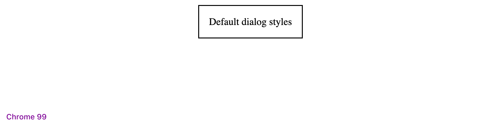


Only minor differences in the border-width it seems.
When there’s too much content, all dialogs will have an inner scroll. This makes adding a modal header a little annoying as you’ll have to ether add position: sticky, or create some custom components within to handle the scroll.
Functionality
By default, there’s no HTML magic you can use to toggle <dialog> elements—you have to write some JavaScript to open and close them programmatically. However, you can force a <dialog> open with the open attribute, which you can see in action in my previously linked CodePen.
Here’s what else you can do with a <dialog>:
- Open regular, absolutely positioned dialogs with the
show()method if you don’t want a modal or backdrop - Open modal dialogs with the
showModal()method to open fixed position dialogs that block other page interactions - Close dialogs with the
close()method - Use
Escto close the dialog without any additional code - Style and animate the
::backdroppseudo-element - Add a specific
autofocusattribute inside the<dialog>to automatically focus on it (otherwise, the first focusable element will be focused)
Unfortunately, because the modal <dialog> backdrop is a pseudo-element, you cannot trigger JavaScript events off it. This makes it impossible to click the backdrop to dismiss the dialog. There’s likely a solution here with non-modal <dialog>s, but I haven’t implemented a smooth solution to this yet.
Regarding dialogs autofocus-ing on the first focusable element, I suggest including a dismiss button near the top. When dialogs are too long and they scroll, it will automatically jump to that focused element. That means if you only have a dismiss button or single action at the bottom of the dialog, your visitors will miss the top portion.
Suggested styling
Dialogs leave a lot to be desired with that default styling, but they are just as style-able as any other element. I put together a CodePen demo that shows some suggested styles and implements easy toggling and closing via JavaScript.
See the Pen Using the <dialog> element by Mark Otto (@emdeoh) on CodePen.
Most dialogs include an inner header element with title and dismiss button, so I’ve implemented the same into my CodePen demo. I’ve also the position: sticky style I mentioned earlier to the dialog header so that when the dialog has an inner scroll, the dialog title and dismiss button are always visible. The dismiss button here also traps that default autofocus. Lastly, the backdrop is styled with a translucent background-color and a quick little fade-in animation.
Lastly, I made it all dark mode friendly with the help of some CSS variables and the prefers-color-scheme media query.
Show and hide
On the JS side, showing and hiding the dialog is easy enough. In my demo, this is accomplished with data attributes:
data-toggleis added to any triggering element and it’s value is the specified target<dialog>data-closeis a boolean attribute that finds the nearest<dialog>to hide
Here’s the complete JS in action.
let toggler = document.querySelectorAll('[data-toggle]')
let closers = document.querySelectorAll('[data-close]')

if (toggler) {
  toggler.forEach(function (element) {
    let target = element.getAttribute("data-toggle")
    let targets = document.querySelectorAll(target)

    element.addEventListener("click", (event) => {
      targets.forEach(function (e) {
        e.showModal()
      })
    })
  })

  closers.forEach(function (element) {
    element.addEventListener("click", (event) => {
      let dialog = element.closest('dialog')
      dialog.close()
    })
  })
}
You can see it all in the demo.
Details element
Before the <dialog> support for Safari dropped this week, I was playing with the <details> element to build dropdowns and modals. It was definitely a fun and worthwhile experiment, and there’s a lot more I want to explore here around keyboard navigation and better modal styling/positioning. For now though, it’s a good comparison to the new <dialog> element and how you can create custom HTML elements.
See the Pen Modals, dropdowns, and more by Mark Otto (@emdeoh) on CodePen.
Resources
- MDN: The dialog element
- Introducing the dialog element (in Safari/Webkit)