Designing dropdowns in Bootstrap
February 27, 2012
A recent question on Stack Overflow regarding Bootstrap’s dropdown menus got me thinking I should do a few posts on some of our design decisions. Folks seem curious about certain aesthetics and behavior, and I’d love to shed some light if I can. Beyond explaining existing decisions, I hope these posts can help guide future updates to the docs as well.
To start, let’s talk dropdowns.
Appearance
Before Bootstrap 2 launched, our dropdowns were confined to the topbar (now the navbar) and were thus styled to be white text on black background. This fit with what we do on Twitter.com and helped the topbar feel more complete with the dropdowns as a natural extension of that style. However, we knew we wanted dropdowns to work in a number of components, so we flipped the color scheme back to black on white.
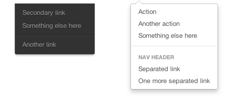
This resulted in improved contrast for the text (especially for typeahead) and made dropdowns work much better for buttons and the like. This gave us a standardized design and cleared up a lot of CSS had we chosen to keep the previous inverted colors. Simpler appearance, simpler codebase.
Behavior
There has always been contention between hover and click events in interaction design. In general I am against using hover as a trigger because things can get messy quickly. The best (worst?) example of this may have been hovercards on Twitter.com from a couple years back. They were great in terms of their content and utility, but not so great in the fact that they seemed to fire without the user intending them to. Inevitably we dropped them and now have a mini profile modal with the latest redesign.
In Bootstrap, we use a mix of both hover and click though–hover for tooltips and popovers, clicks for dropdowns and more. What it really boils down to is user intent. The purpose of a hover state is to indicate something is clickable (underlined text) or to provide some quick information (full URL in a tooltip). The purpose of a click is to actually do something, to take an explicit action. Opening a dropdown is an explicit action and should only happen on click.
Additional notes
It behooves me to mention a few other quick thoughts on our dropdowns:
- The aesthetic was derived from menus OS X. They’re super simple, elegant, and scalable.
- Prior to open sourcing Bootstrap, the dropdowns were actually fired on hover. We changed this because as soon as your cursor leaves a dropdown, it disappears.
- The caret in a dropdown link is the equivalent of underlining a link: it provides some affordance for what will happen when you click this element. Don’t mistake that for providing enough information to pop the dropdown on hover though.
- Because we use a click to trigger the dropdown in most implementations, there is no option for a parent link (one of the primary complaints in that Stack Overflow article). Pointing back to OS X and other toolbars, I don’t see this as a huge issue as it promotes our advocacy of using clicks to carry out an action instead of hovers.
And that’s it—dropdowns in Bootstrap explained. Stay tuned for more posts like this in the future. If you’d like me to elaborate on another particular feature of Bootstrap, please hit me up on Twitter or send me an email.